 to include or exclude labels in the heatmap. Move your mouse over a rectangle to see additional information. By default, this display shows all Owners, all Environments and the Alert Impact.
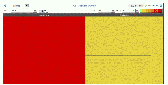
View the most critical alert state for all monitored instances throughout your system. Consider keeping this display open to monitor conditions in your system. The heatmap organizes monitored instances by one or all Owners for all Areas, and uses color to show the most critical alert state in each. Each rectangle in the heatmap represents a management Area (for example, Applications, Demo Systems and so forth), which are also grouped by Owner. The rectangle size represents the number of CIs in the rectangle; a larger size is a larger value.
Use the available drop-down menus or right-click to filter data shown in the display. Use the check-boxesto include or exclude labels in the heatmap. Move your mouse over a rectangle to see additional information. By default, this display shows all Owners, all Environments and the Alert Impact.
Drill-down and investigate by clicking a rectangle in the heatmap to view details for the selected Area in the display that was last selected under Multi Area Service Views. For example, if the last selected display under Multi Area Service Views was Group / Service Table, then clicking an Area in the heatmap results in displaying details in the Group/Service Table display.
|
Filter By: The following filtering options are typically included: |
||||
|
|
Owner: Choose an Owner to see metrics for Areas associated with that Owner. Area: Choose an Area to see metrics for Groups associated with that Area and Owner. Group: Choose a Group to see metrics for Services associated with that Group, Area and Owner. Service: Choose a Service to see metrics for Environments associated with that Service, Group, Area and Owner. Env: Choose an Environment to see metrics for Environments associated with that Service, Group, Area and Owner. |
|||
|
Metric: Choose the type of metric to show in the heatmap. Each metric has its own gradient bar that maps relative values to colors: |
||||
|
|
|
Alert Impact |
The product of the maximum Alert Severity of alerts in the heatmap rectangle multiplied by the maximum Criticality of alerts in the heatmap rectangle. Values range from 0 - 10, as indicated in the color gradient |
|
|
|
|
Alert Severity |
The maximum level of alerts in the heatmap rectangle. Values range from 0 - 2, as indicated in the color gradient
|
|
|
|
|
Alert Count |
The total number of critical and warning alerts in the heatmap rectangle. The color gradient |
|
|
|
|
Criticality |
The maximum level of Criticality (rank of importance) in the heatmap rectangle. Values range from 1 to 5, as indicated in the color gradient Criticality is specified in the Service Data Model (CMDB) by your administrator. Criticality values are listed in the Component Views - “CI / Service Table” display, which range from A to E, where A is the highest Criticality (level 5 maps to a Criticality of A and level 1 maps to a Criticality of E with equally spaced intermediate values). |
|
 bar, where
  bar, where
 Yellow indicates that one or more metrics have reached their alarm threshold. Metrics that have exceeded their specified WARNING LEVEL threshold have an Alert Severity value of
  Green indicates that no metrics have reached their alert thresholds. Metrics that have not exceeded their specified thresholds have an Alert Severity value of
  bar, populated by the current heatmap, shows the value/color mapping. The numerical values in the gradient bar range from
  bar, where