Heatmaps
Heatmaps organize CIs (according to the Service Data Model) into rectangles and use color to highlight the most critical value in each. Heatmaps enable you to view various alert metrics in the same heatmap using drop-down menus. Each Metric has a color gradient bar that maps relative values to colors. In most heatmaps, the rectangle size represents the number of CIs in the rectangle; a larger size is a larger value.
Heatmaps scale color for a given metric according to the following rules and are applied in the following order:
a) If the metric is associated with an alert, then the color range is scaled from zero to the metric's high Alarm Level threshold, and the color will be red for values near the alerm threshold.
b) If the metric is not associated with an alert, but the metric is bounded (for example, the CPU % utilization value must be in the 0 to 100% range), then the color is scaled using the user-specified maximum value for the metric.
c) Otherwise, the metric is autoscaled into a color range from white (minimum) to green (high) using the current highest metric value observed over the monitored entities.
By default, the metric is linearly scaled to an appropriate color. If the Log checkbox is checked, then the selected color reflects the logarithm of the current metric value.
Heatmaps include drop-down menus to filter data by Owner, Area, Group, Service, Region and Environment. The filtering options vary among heatmaps.
For example, the All Management Areas - Area Heatmap (shown in the following figure) illustrates a typical RTView Enterprise heatmap. The heatmap contains a Metric drop-down menu with options to show Alert Impact, Alert Severity, Alert Count and Criticality (menu options vary according to the data populating the heatmap). Alert Impact is selected and its corresponding color gradient bar  is shown. Each rectangle represents all CIs in an Area. The red rectangle in the heatmap indicates that one or more CIs in that Area currently has an alert in an alarm state. The yellow rectangles in the heatmap indicate that one or more CIs in those Areas currently have an alert in a warning state. A green rectangle would indicate that no alert is in a warning or alarm state in an Area.
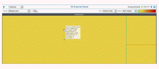
Continuing with our example, there are two filtering options. You can choose to show all Owners or a single Owner, and all Environments or a single Environment. Each rectangle represents an Area. The rectangle size represents the number of CIs in the rectangle; a larger size is a larger value. Use the check-boxes  to include or exclude labels in the heatmap. Move your mouse over a rectangle to see additional information. The following figure illustrates the mouse-over feature in which we see all the Metric drop-down values.
In most heatmaps, you can also drill-down to more detail by clicking a rectangle in the heatmap. Or, click Open New Window  and then drill-down. The drill-down opens a display that contains relevant and more detailed data.
|
Filter By:
The following filtering options are typically included:
|
|
|
Owner: Choose an Owner to see metrics for Areas associated with that Owner.
Area: Choose an Area to see metrics for Groups associated with that Area and Owner.
Group: Choose a Group to see metrics for Services associated with that Group, Area and Owner.
Service: Choose a Service to see metrics for Environments associated with that Service, Group, Area and Owner.
Env: Choose an Environment to see metrics for Environments associated with that Service, Group, Area and Owner.
|
|
Metric:
Choose the type of metric to show in the heatmap. Each metric has its own gradient bar that maps relative values to colors:
|
|
|
|
Alert Impact
|
The product of the maximum Alert Severity of alerts in the heatmap rectangle multiplied by the maximum Criticality of alerts in the heatmap rectangle. Values range from 0 - 10, as indicated in the color gradient  bar, where 10 is the highest Alert Impact. bar, where 10 is the highest Alert Impact.
|
|
|
|
Alert Severity
|
The maximum level of alerts in the heatmap rectangle. Values range from 0 - 2, as indicated in the color gradient  bar, where 2 is the highest Alert Severity. bar, where 2 is the highest Alert Severity.
 Red indicates that one or more metrics have reached their alarm threshold. Metrics that have exceeded their specified ALARM LEVEL threshold have an Alert Severity value of 2. Red indicates that one or more metrics have reached their alarm threshold. Metrics that have exceeded their specified ALARM LEVEL threshold have an Alert Severity value of 2.
 Yellow indicates that one or more metrics have reached their alarm threshold. Metrics that have exceeded their specified WARNING LEVEL threshold have an Alert Severity value of 1. Yellow indicates that one or more metrics have reached their alarm threshold. Metrics that have exceeded their specified WARNING LEVEL threshold have an Alert Severity value of 1.
 Green indicates that no metrics have reached their alert thresholds. Metrics that have not exceeded their specified thresholds have an Alert Severity value of 0. Green indicates that no metrics have reached their alert thresholds. Metrics that have not exceeded their specified thresholds have an Alert Severity value of 0.
|
|
|
|
Alert Count
|
The total number of critical and warning alerts in the heatmap rectangle. The color gradient  bar, populated by the current heatmap, shows the value/color mapping. The numerical values in the gradient bar range from 0 to the maximum count of alerts in the heatmap. The middle value in the gradient bar indicates the average alert count. bar, populated by the current heatmap, shows the value/color mapping. The numerical values in the gradient bar range from 0 to the maximum count of alerts in the heatmap. The middle value in the gradient bar indicates the average alert count.
|
|
|
|
Criticality
|
The maximum level of Criticality (rank of importance) in the heatmap rectangle. Values range from 1 to 5, as indicated in the color gradient  bar, where 5 is the highest Criticality. bar, where 5 is the highest Criticality.
Criticality is specified in the Service Data Model (CMDB) by your administrator. Criticality values are listed in the Component Views - “CI / Service Table” display, which range from A to E, where A is the highest Criticality (level 5 maps to a Criticality of A and level 1 maps to a Criticality of E with equally spaced intermediate values).
|