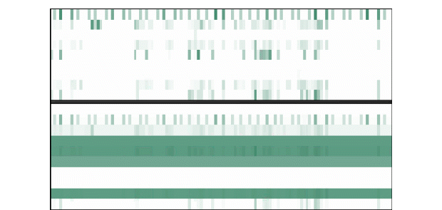
History heatmaps, such as the following cache heatmap, show you utilization trends, over time, for an entire Oracle Coherence cluster.
Each row represents a cache. Each column represents a time period. A darker color indicates heavier usage, a lighter color indicates lighter usage. At a glance, you can quickly analyze load distribution, check for bottlenecks and identify caches with high usage. You can also answer questions such as, Is the cluster using what I expect? Is the cluster using it in a uniform scale? If there is an issue, you can mouse-over the heatmap to see when the issue started, what behavior preceded it, and the name of the resource.
Additionally, because data updates for all the elements in your cluster share the same time-stamp, you can see utilization spikes in the cluster, such as in trend graphs or heatmaps, and immediately address performance issues. Other monitoring systems cannot gather enough simultaneous data points for displaying spikes.