Oracle Databases View
These displays present performance metrics for Oracle databases. Displays are:
| • | Oracle Databases Table : A list of all Oracle databases with detailed utilization metrics. |
| • | Databases Heatmap : A heatmap shows alert status of all Oracle databases. |
| • | Databases Summary : Detailed performance metrics for one Oracle database. |
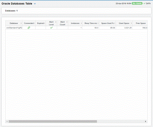
Oracle Databases Table
Investigate and compare detailed utilization metrics for all Oracle databases. This display contains all metrics available for Oracle databases, including Space Used, Free Space, Total Space and the number of Instances on each.
Each row in the table contains data for a particular Oracle database. Click a column header to sort column data in ascending or descending order. Double-click on a table row to drill-down to the Databases Summary display and view metrics for that particular Oracle database. Toggle between the commonly accessed Heatmap and Summary displays by clicking the drop down list on the display title.
Right-click on a table cell to Export to Excel or Copy Cell Value.
The Alert Level column indicates the most critical alert on the database, where:
|
|
|
 Red indicates that one or more alerts exceeded their ALARM LEVEL threshold in the table row.
 Yellow indicates that one or more alerts exceeded their WARNING LEVEL threshold in the table row.
 Green indicates that no alerts have reached their alert thresholds.
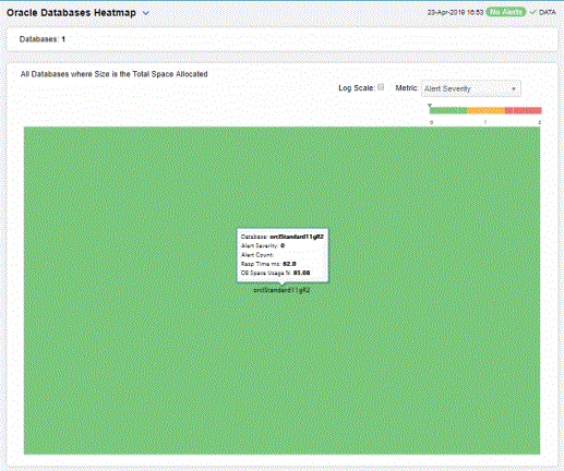
Databases Heatmap
View status and alerts for all Oracle databases. Use this display to quickly identify a database with performance or utilization issues.
Choose a Metric from the drop-down menu: Alert Severity, Alert Count, Response Time or DB Space Usage %.
Each heatmap rectangle represents a different database. The rectangle color indicates the most critical alert state for the selected metric. Click rectangle to view details in the Databases Summary display and view metrics for a particular database.
Toggle between the commonly accessed Table and Heatmap displays by clicking the drop down list on the display title. Mouse-over rectangles to view more details about database performance and status.
You can view data based on a log scale, which enables visualization on a logarithmic scale and should be used when the range in your data is very broad.
|
Metric: Choose the type of metric to show in the heatmap. Each metric has its own gradient bar that maps current relative values to colors: |
||||
|
|
|
Alert Severity |
The maximum level of alerts in the heatmap rectangle. Values range from 0 - 2, as indicated in the color gradient
|
|
|
|
|
Alert Count |
The total number of critical and warning alerts in the heatmap rectangle. The color gradient |
|
|
|
|
Response Time |
The amount of time, in milliseconds, since the last execution of the database. The color gradient |
|
|
|
|
Database Space Usage |
The amount of space used, in megabytes, in the heatmap rectangle. The color gradient |
|
 bar, where 2 is the highest Alert Severity.
 Yellow indicates that one or more metrics have reached their alarm threshold. Metrics that have exceeded their specified WARNING LEVEL threshold have an Alert Severity value of 1.
 Green indicates that no metrics have reached their alert thresholds. Metrics that have not exceeded their specified thresholds have an Alert Severity value of 0.
 bar, populated by the current heatmap, shows the value/color mapping. The numerical values in the gradient bar range from 0 to the maximum count of alerts in the heatmap. The middle value in the gradient bar indicates the average alert count.

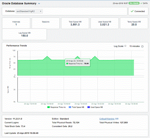
Databases Summary
Track utilization and performance metrics for a specific database. Choose a Database from the drop-down menu. Mouse-over the utilization information boxes at the top of the display to see more details. Clicking on them takes you to the Oracle Databases Table display, where you can compare metrics with other Oracle databases.
The trend graph traces Response Time, Total Space and Used Space. Mouse-over to see the values at a particular time. You can specify the time range for the trend graph and view data based on a log scale, which enables visualization on a logarithmic scale and should be used when the range in your data is very broad.
Clicking the Critical/Warning link at the bottom of the display opens the Alerts Table by Component display.