Heatmaps
Heatmaps organize CIs (according to the Service Data Model) into rectangles and use color to highlight the most critical value in each. Heatmaps enable you to view various alert metrics in the same heatmap using drop-down menus. Each Metric has a color gradient bar that maps relative values to colors. In most heatmaps, the rectangle size represents the number of CIs in the rectangle; a larger size is a larger value.
Heatmaps scale color for a given metric according to the following rules and are applied in the following order:
a) If the metric is associated with an alert, then the color range is scaled from zero to the metric's high Alarm Level threshold, and the color will be red for values near the alarm threshold.
b) If the metric is not associated with an alert, but the metric is bounded (for example, the CPU % utilization value must be in the 0 to 100% range), then the color is scaled using the user-specified maximum value for the metric.
c) Otherwise, the metric is autoscaled into a color range from white (minimum) to green (high) using the current highest metric value observed over the monitored entities.
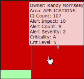
Mouse-over
The mouse-over functionality provides additional detailed data in an over imposed pop-up window when you mouse-over a heatmap. The following figure illustrates mouse-over functionality in a heatmap object. In this example, when you mouse-over a host, details are shown such as CI Count, Alert Impact, Alert Severity, and Criticality.