IBM WebSphere
The IBM WebSphere HTML displays provide extensive visibility into the health and performance of IBM WebSphere application servers and installed web modules. The following IBM WebSphere Views (and their associated displays) can be found under Components tab > Application/Web Servers > IBM WebSphere.
IBM WebSphere has the following displays:
| • | WebSphere Overview |
| • | WebSphere Servers Heatmap: Performance metrics for one IBM WebSphere Server, including current and historic performance metrics. |
| • | WebSphere Server Summary: Heatmap of performance metrics for all Web modules for one IBM WebSphere Server. |
| • | WebSphere Apps Table: Table and trend graphs of performance metrics for Web modules. |
| • | WebSphere Apps Heatmap |
| • | WebSphere App Summary |
WebSphere Overview
The WebSphere Overview is the top-level display for the WebSphere Solution Package, which provides a good starting point for immediately getting the status of all your WebSphere servers, web modules and connections. You can select the RTView DataServer for which you want to see data and easily view the current data for that DataServer including:
| • | The total number of active alerts for the selected DataServer, including the total number of critical and warning alerts. |
| • | The greatest number of Live Sessions and Top System/JVM CPU%. |
| • | A bar graph shows the WebSphere servers with the Top 10 System CPU % usage, and allows you to instead show the Top 10 JVM CPU % usage, the Top 10 System Max Heap MB usage, the Top 10 Cur Heap usage, the Top 10 Used Heap usage or the Top 10 Live Sessions. |
You can hover over the metric cards in the upper half of the Overview and click to investigate details in a Summary display.
You can choose a Cell, Node and Server from the drop-down menus for the trend graph which traces System CPU %, Live Sessions, JVM CPU%, Max Heap and Used Heap MB.
You can hover over the trend graph to see the values at a particular time. You can specify the time range for the trend graph and view data based on a log scale, which enables visualization on a logarithmic scale and should be used when the range in your data is very broad.

WebSphere Servers Table
Investigate detailed utilization metrics and configuration settings for all or one WebSphere cell and all or one WebSphere node. The Websphere Servers Table contains all metrics available for servers, including the number of current client connections.
Each row in the table contains data for a particular Node. You can search, filter, sort and choose columns to include by clicking a column header icon (to the right of each column label) and selecting Filter, Sort Ascending, Sort Descending or Columns. Or just click a column header to sort.
Right-click on a table cell to Export to Excel or Copy Cell Value.
You can click on a row to drill-down to the WebSphere Server Summary display and view details for that server.
WebSphere Servers Heatmap
View performance metrics for all monitored WebSphere Servers. The heatmap organizes WebSphere Web modules by server, and uses color to show the most critical Metric value for each WebSphere connection associated with the selected source. Each rectangle in the heatmap represents a Web module. In this heatmap, the rectangle size represents the value for maximum heap memory used. Each Metric (selected from the drop-down menu) has a color gradient bar that maps relative values to colors.
Use this display to see at-a-glance the health of all your web applications. You can select the heatmap color metric from a list including active sessions, access rate, and total access count.
Use the available drop-down menus or right-click to filter data shown in the display. Use the check-boxes to include or exclude labels in the heatmap. Move your mouse over a rectangle to see additional information. Drill-down and investigate by clicking a rectangle in the heatmap to view details for the selected Web module in the Server Summary display.
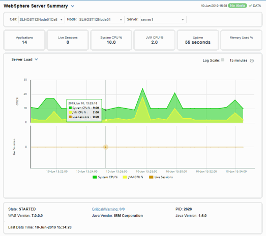
WebSphere Server Summary
Track utilization and performance metrics for a connection on a WebSphere server. Clicking on the sessions/processing rate information boxes at the top of the display takes you to the WebSphere Servers Table display, where you can compare and sort performance values against other WebSphere servers.
The trend graph traces for Processing Time per second, Requests per second and (number of) Active Sessions. You can hover over the trend graph to see the values at a particular time. You can specify the time range for the trend graph and view data based on a log scale, which enables visualization on a logarithmic scale and should be used when the range in your data is very broad.
Clicking the Critical/Warning link at the bottom of the display opens the Alerts Table by Component display.
WebSphere Apps Table
Investigate detailed utilization metrics for all WebSphere applications. This display contains all metrics available for WebSphere applications, including the total Alert Count, Accesses/per second and Total Sessions.
Choose a particular Source or All, and a particular Connection or All, from the drop-downs. Each row in the table contains data for a particular web module. You can search, filter, sort and choose columns to include by clicking a column header icon (to the right of each column label) and selecting Filter, Sort Ascending, Sort Descending or Columns.
To investigate further, double-click a web module to see details in the WebSphere Application Summary display.
Or just click a column header to sort. Right-click on a table cell to Export to Excel or Copy Cell Value.
WebSphere Apps Heatmap
This heatmap allows you to view the status and alerts of WebSphere applications on a particular host or All hosts, and a particular connection or All connections.
Use the Metric drop-down menu to view the Alert Severity, Alert Count, Active Sessions, Accesses per Second or (the total number of) Accesses.
Each rectangle in the heatmap represents a web module. The rectangle color indicates the most critical alert state. Click on a rectangle to drill-down to the WebSphere Application Summary display and view metrics for a particular web module. Toggle between the commonly accessed Table and Heatmap displays by clicking the drop down list on the display title.
Mouse-over rectangles to view more details about host performance and status.
You can view data based on a log scale, which enables visualization on a logarithmic scale and should be used when the range in your data is very broad.
WebSphere App Summary
Track utilization and performance metrics for a particular WebSphere web module. Clicking on the sessions/processing rate information boxes at the top of the display takes you to the WebSphere Servers Table display, where you can compare and sort performance values against other WebSphere servers.
Use the Web Modules table to compare detailed utilization metrics for all web modules. Each row in the table contains data for a particular web module. You can search, filter, sort and choose columns to include by clicking a column header icon (to the right of each column label) and selecting Filter, Sort Ascending, Sort Descending or Columns.
Or just click a column header to sort. Right-click on a table cell to Export to Excel or Copy Cell Value.
The trend graph traces for Processing Time per second, Accesses per second and (the number of) Active Sessions. You can hover over the trend graph to see the values at a particular time. You can specify the time range for the trend graph and view data based on a log scale, which enables visualization on a logarithmic scale and should be used when the range in your data is very broad.
Clicking the Critical/Warning link at the bottom of the display opens the Alerts Table by Component display.