BW Application Nodes
These displays present internal JVM memory and host CPU utilization for BusinessWorks AppNodes and their resources, which can be useful because the AppNode performance is dependent on both internal and external factors and they sometimes interact. Clicking BW Application Nodes from the left/navigation menu opens the TIBCO BusinessWorks Application Nodes Table display, which shows a tabular view of all available utilization data. The options available under BW Application Nodes are:
| • | BW Application Nodes Heatmap: Opens the TIBCO BusinessWorks Application Nodes Heatmap , which shows a color-coded heatmap view of utilization metrics. |
| • | BW Application Node: Opens the TIBCO BusinessWorks Application Node Summary display, which shows Current and historical metrics for a single AppNode. |
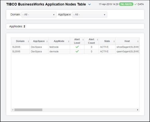
TIBCO BusinessWorks Application Nodes Table
View BusinessWorks data shown in the TIBCO BusinessWorks Application Nodes Heatmap display, and additional details, in a tabular format. Use this display to view all available data for each AppNode by Domain and AppSpace. Each row in the table is an AppNode. Choose a domain and AppSpace from the drop-down menus. Click a column header to sort column data in numerical or alphabetical order. Drill-down and investigate by clicking a row to view details for the selected AppNode in the TIBCO BusinessWorks Application Node Summary display.
|
Filter By: The display might include these filtering options: |
||||
|
|
Domain: |
Choose a domain to show data for in the display. |
||
|
|
AppSpace |
Choose an AppSpace to show data for in the display. |
||
|
AppNodes: |
The total number of rows in the table. |
|||
|
Table: Column values describe the AppNode. |
||||
|
|
Domain |
The domain in which the AppNode resides. |
||
|
|
AppSpace |
The AppSpace in which the AppNode resides. |
||
|
|
AppNode |
The name of the AppNode. |
||
|
|
Alert Level |
The most critical alert state for alerts in the row:
|
||
|
|
Alert Count |
The total number of active alerts for the AppNode. |
||
|
|
State |
The current status of the application. Valid values are Running and Stopped. |
||
|
|
Host |
The host on which the AppNode resides. |
||
|
|
Deployment |
The type of deployment. |
||
|
|
Processes |
The number of processes running. |
||
|
|
Active Threads |
The number of currently active threads. |
||
|
|
Total Memory |
The total amount of used and free memory, in megabytes. |
||
|
|
Used Memory |
The amount of used memory, in megabytes. |
||
|
|
Free Memory |
The amount of free memory, in megabytes. |
||
|
|
Used Memory % |
The percent (%) used memory. |
||
|
|
Used CPU % |
The percent (%) used CPU. |
||
|
|
Active Processes |
The number of currently active application processes. |
||
|
|
Active/s |
The rate of application processes becoming active. |
||
|
|
Created Processes |
The number of application processes that have been created. |
||
|
|
Created /s |
The number of application processes created per second. |
||
|
|
Completed Processes |
The number of completed application processes. |
||
|
|
Completed/s |
The rate of application processes being completed. |
||
|
|
Most Recent Exec Time ms |
The number of seconds for the most recently executed process, in milliseconds. |
||
|
|
Rate Exec Time ms/s |
The number of application processes executed per second. |
||
|
|
Suspended Processes |
The number of suspended application processes. |
||
|
|
Failed Processes |
The number of failed application processes. |
||
|
|
System Process ID |
A unique string identifier for the process. |
||
|
|
Up Since |
The date and time the AppNode was last started. |
||
|
|
Time Stamp |
The date and time the row data was last updated. |
||
|
|
Source |
Name of RTView Data Server sending this data (or localhost). |
||
|
|
Expired |
When checked (true), performance data has not been received within the time specified (in seconds) in the Expire Time field in the Duration region in the RTView Configuration Application > (Project Name) > Solution Package Configuration > TIBCO BusinessWorks > DATA STORAGE tab. The Delete Time field (also in the Duration region) allows you to define the amount of time (in seconds) in which the row will be removed from the table if there is no response. |
||


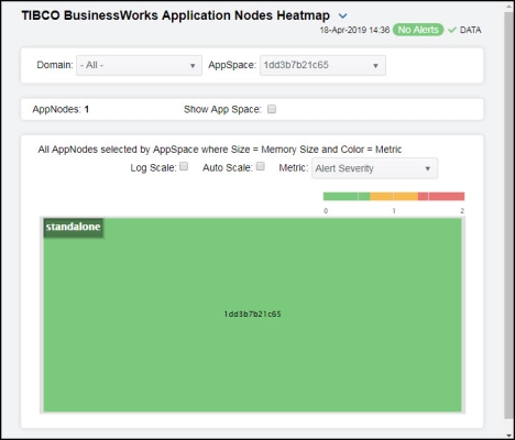
TIBCO BusinessWorks Application Nodes Heatmap
Clicking BW Application Nodes Heatmap in the left/navigation menu opens the TIBCO BusinessWorks Application Nodes Heatmap, which allows you to view the most critical JVM memory and host resource utilization for BusinessWorks AppNodes. Use this display to quickly identify AppNodes with critical alerts.
Each rectangle in the heatmap represents an AppNode. The rectangle color indicates the most critical alert state associated with the AppNode. The rectangle size represents the maximum memory used in the rectangle; a larger size is a larger value. Choose a domain and AppSpace from the drop-down menus. Choose a different metric to display from the Metric drop-down menu.
Use the Show AppSpace check-box  to include or exclude labels in the heatmap. Mouse over a rectangle to see additional metrics. By default, this display shows Alert Severity. Drill-down and investigate by clicking a rectangle in the heatmap to view details for the selected application in the TIBCO BusinessWorks Application Node Summary display. Toggle between the commonly accessed Table and Heatmap displays by clicking the drop down list on the display title.
|
Filter By: The display might include these filtering options: |
||||
|
|
Domain: |
Choose a domain to show data for in the display. |
||
|
|
AppSpace |
Choose an AppSpace to show data for in the display. |
||
|
|
AppNodes: |
The total number of AppNodes in the AppSpace. |
||
|
|
Show AppSpace |
When selected, the names of the AppSpaces associated with the AppNodes display in the heatmap. |
||
|
|
Log Scale |
Select to enable a logarithmic scale. Use Log Scale to see usage correlations for data with a wide range of values. For example, if a minority of your data is on a scale of tens, and a majority of your data is on a scale of thousands, the minority of your data is typically not visible in non-log scale graphs. Log Scale makes data on both scales visible by applying logarithmic values rather than actual values to the data. |
||
|
|
Auto Scale |
Select to enable auto-scaling. When auto-scaling is activated, the color gradient bar's maximum range displays the highest value. NOTE: Some metrics auto-scale automatically, even when Auto is not selected. |
||
|
|
Metric |
Select the metric driving the heatmap display. The default is Alert Severity. Each Metric has a color gradient bar that maps values to colors. The heatmap organizes the servers by host, where each rectangle represents a server. Mouse-over any rectangle to display the current values of the metrics for the Server. Click on a rectangle to drill-down to the associated TIBCO BusinessWorks Application Node Summary display for a detailed view of metrics for that particular AppNode. |
||
|
|
|
Alert Severity |
The maximum level of alerts in the heatmap rectangle. Values range from 0 - 2, as indicated in the color gradient
|
|
|
|
|
Alert Count |
The total number of critical and warning alerts in the heatmap rectangle. The color gradient |
|
|
|
|
CPU Used% |
The percent (%) CPU used in the heatmap rectangle. The color gradient |
|
|
|
|
Memory Used% |
The percent (%) memory used in the heatmap rectangle. The color gradient |
|
|
|
|
Active Processes |
The number of currently active processes in the heatmap rectangle. The color gradient |
|
|
|
|
Created Processes |
The number of processes created in the heatmap rectangle. The color gradient |
|
|
|
|
Created/sec |
The number of processes created per second in the heatmap rectangle. The color gradient |
|
|
|
|
Failed Processes |
The number of failed processes in the heatmap rectangle. The color gradient |
|


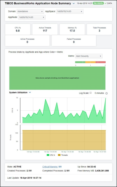
TIBCO BusinessWorks Application Node Summary
Clicking BW Application Node in the left/navigation menu opens the TIBCO BusinessWorks Application Node Summary display, which allows you to view current and historical utilization and performance metrics for a single BusinessWorks AppNode. Use this display to investigate performance issues on an AppNode. Clicking on the information boxes at the top of the display takes you to the TIBCO BusinessWorks Application Nodes Table display, where you can view additional AppNode data.
In the Processes totals by AppNode and App heatmap, you can select from the available metrics to view the current status of the processes running on the selected AppNode. Available metrics include Alert Severity, Alert Count, Created/s, and Average Execution.
You can select from two different trend graphs: System Utilization and Memory Utilization. In the System Utilization trend graph region, you can view the CPU percentage and number of threads over a selected time range. In the Memory Utilization trend graph region, you can view the memory percentage and number of bytes over a selected time range.
Clicking the Critical/Warning link at the bottom of the display opens the Alerts Table by Component display.
|
Filter By: The display might include these filtering options: |
||||
|
|
Domain: |
Choose a domain to show data for in the display. |
||
|
|
AppSpace |
Choose an AppSpace to show data for in the display. |
||
|
|
AppNode: |
Choose an AppNode to show data for in the display. |
||
|
Fields and Data: |
||||
|
|
CPU % |
The percent (%) CPU used on the AppNode. |
||
|
|
Active Threads |
The number of currently active threads for the AppNode. |
||
|
|
Memory % |
The percentage of memory utilization on the AppNode. |
||
|
|
Total Processes |
The total number of processes on the AppNode. |
||
|
|
Active Processes |
The total number of active processes on the AppNode. |
||
|
|
Failed Processes |
The total number of failed processes on the AppNode. |
||
|
Heatmap Metrics |
Each rectangle in the heatmap represents an AppNode. Click a rectangle to drill-down and investigate in the TIBCO BusinessWorks Application Summary display. |
|||
|
|
|
Alert Severity |
The maximum level of alerts in the heatmap rectangle. Values range from 0 - 2, as indicated in the color gradient
|
|
|
|
|
Alert Count |
The total number of critical and warning alerts in the heatmap rectangle. The color gradient |
|
|
|
|
Created/s |
The number of processes created per second in the heatmap rectangle. The color gradient |
|
|
|
|
Average Execution |
The average number of processes executed in the heatmap rectangle. The color gradient |
|
|
Trend Graphs |
System Utilization Traces the sum of process metrics across all processes for all applications on the AppNode. CPU% -- Traces he percent (%) CPU used on the AppNode. Threads -- Traces the number of threads. Memory Utilization Traces the sum of process metrics across all processes for all applications on the AppNode. Memory Percentage -- Traces the percentage of memory used. Bytes -- Traces the total number of bytes. |
|||
|
|
Log Scale |
Select to enable a logarithmic scale. Use Log Scale to see usage correlations for data with a wide range of values. For example, if a minority of your data is on a scale of tens, and a majority of your data is on a scale of thousands, the minority of your data is typically not visible in non-log scale graphs. Log Scale makes data on both scales visible by applying logarithmic values rather than actual values to the data. |
||
|
|
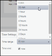
Time Settings |
Select a time range from the drop down menu varying from 5 Minutes to Last 7 Days. By default, the time range end point is the current time.
To change the time range, deselect the now toggle, which displays some additional date fields. You can click the left and right arrow buttons to decrease the end time by one time period (the time selected in the Time range drop down) per click, or you can choose the date and time from the associated calendar and clock icons. You can also enter the date and time in the text field using the following format: MMM dd, YYYY HH:MM:ss. For example, Aug 21, 2018 12:24 PM. Click the now toggle to reset the time range end point to the current time.
|
||
|
|
State |
The current status of the application. Valid values are Running and Stopped. |
||
|
|
Created Processes |
The total number of processes that have been created on the AppNode. |
||
|
|
Critical/Warning |
The number of critical and warning alerts. |
||
|
|
Completed Processes |
The total number of processes that have been completed on the AppNode. |
||
|
|
Up Since |
The number of days, hours, minutes, and seconds that the AppNode has been up and running. |
||
|
|
Free Memory MB |
The amount of available memory on the AppNode, in megabytes. |
||
|
|
Last Update |
The date and time of the last data update. |
||