Grids Views
These displays provide detailed data for all grids in a heatmap and tabular format. Clicking Grids in the left/navigation menu opens the TIBCO ActiveSpaces Grids Table , which provides a tabular view of your grids and their associated metrics. Displays in this View are:
| • | All Grids Heatmap: Opens the TIBCO ActiveSpaces Grids Heatmap display, which provides a heatmap view of all grids. |
| • | Single Grid Summary: Opens the TIBCO ActiveSpaces Grid Summary display, which provides a view of the current and historical metrics for a single grid. |
| • | Realm Servers: Opens the TIBCO ActiveSpaces Realm Server display, which provides a view of the server CPU percent usage and the server memory used by the realm server manging the grid (in KBs) in a trend graph format. |
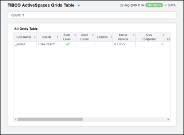
TIBCO ActiveSpaces Grids Table
The table in this display provides a view of all of your grids and their associated metric data including alert level, alert count, and the current value of each gathered metric. You can click a column header to sort column data in numerical or alphabetical order, and drill-down and investigate by double-clicking a row to view details for the selected grid in the TIBCO ActiveSpaces Grid Summary display.
|
All Grids Table |
||||
|
|
Grid Name |
The name of the grid. |
||
|
|
Realm |
The name of the realm. |
||
|
|
Alert Level |
The current alert severity.
|
||
|
|
Alert Count |
The total number of alerts for the host. |
||
|
|
Expired |
When checked, performance data has not been received within the time specified (in seconds) in the Expire Time field in the Duration region in the RTView Configuration Application > (Project Name) > Solution Package Configuration > TIBCO Active Spaces > DATA STORAGE tab. The Delete Time field (also in the Duration region) allows you to define the amount of time (in seconds) in which the row will be removed from the table if there is no response. |
||
|
|
Ops Completed |
The total number of operations completed in the grid.* |
||
|
|
Ops Completed Rate |
The rate of operations completed in the grid.* |
||
|
|
Ops Failed |
The total number of operations failed in the grid.* |
||
|
|
Ops Failed Rate |
The rate of operations failed in the grid.* |
||
|
|
Node Live Data |
The size of the node’s live data.* |
||
|
|
Txn Commits |
The number of transaction commits in the grid.* |
||
|
|
Txn Commits Rate |
The rate of transaction commits in the grid.* |
||
|
|
Txn Rollbacks |
The number of transaction rollbacks in the grid.* |
||
|
|
Txn Rollbacks Rate |
The rate of transaction rollbacks in the grid.* |
||


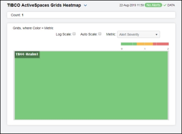
TIBCO ActiveSpaces Grids Heatmap
Clicking All Grids Heatmap in the left/navigation menu opens the TIBCO ActiveSpaces Grids Heatmap, which provides an easy-to-view interface that allows you to quickly identify the current status of each of your grids for each available metric. You can view the grids in the heatmap based on the following metrics: current alert severity, alert count, operations completed, and operations failed. By default, this display shows the heatmap based on the Alert Severity metric.
The heatmap is organized so that each rectangle represents a grid. The rectangle color indicates the most critical alert state. Click on a node to drill-down to the TIBCO ActiveSpaces Grid Summary display and view metrics for a particular grid. Toggle between the commonly accessed displays by clicking the drop down list on the display title. Mouse-over rectangles to view more details about grid performance and status.
|
Fields and Data: |
||||
|
|
Log Scale |
Select this check box to use a logarithmic scale, rather than a linear scale, to map from the selected metric value for a cell to the color for the cell. Log provides another way to distribute and differentiate values that you might not be able to see on a linear scale due to the dominant nature of large values in a linear scale. |
||
|
|
Auto Scale |
When checked, the values of the selected metric are auto-scaled to its highest defined value. When unchecked, the values of the selected metric display based on the threshold defined for the alert associated with the selected metric. Selecting Auto helps to visualize the range of the values currently present for the selected metric instead of the threshold of the alert that has been associated with the metric. All metrics that have not been associated in the heatmap defaults with alerts use a monochromatic color gradient bar (whites and greens). All metrics that have been associated in the heatmap defaults with alerts use a multi-chromatic color gradient bar (reds, yellows, white, and greens). |
||
|
Metric |
||||
|
|
Select the metric driving the heatmap display. The default is Alert Severity. Each Metric has a color gradient bar that maps values to colors. The heatmap is organized by grids, where each rectangle represents a grid. Mouse-over any rectangle to display the current values of the metrics for the grid. Click on a rectangle to drill-down to the associated TIBCO ActiveSpaces Grid Summary display for a detailed view of metrics for that particular grid. |
|||
|
|
Alert Severity |
The current alert severity. Values range from 0 - 2, as indicated in the color gradient
|
||
|
|
Alert Count |
The total number of alarm and warning alerts in a given item (index) associated with the rectangle. The color gradient bar |
||
|
|
Ops Completed |
The number of operations completed in the grid.The color gradient bar |
||
|
|
Ops Failed |
The number of failed operations in the grid. The color gradient bar |
||


 , populated by the current heatmap, shows the value/color mapping. The numerical values in the gradient bar range from 0 to the maximum count of operations in the heatmap. The middle value in the gradient bar indicates the middle value of the range.
 , populated by the current heatmap, shows the range of the value/color mapping. The numerical values in the gradient bar range from 0 to the maximum count of operations that have failed in the heatmap. The middle value in the gradient bar indicates the middle value of the range.
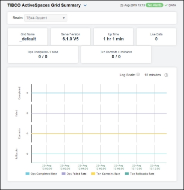
TIBCO ActiveSpaces Grid Summary
Clicking Single Grid Summary in the left/navigation menu opens the TIBCO ActiveSpaces Grid Summary display, which provides a view of the current and historical metrics for a single grid. Hover over the boxes at the top of the display to view additional information. In the trend graph region, you can view the rate of completed operations, the rate of failed operations, the rate of transactions that are committed, and the rate of transactions that are rolled back over a selected time range.
|
Filter By: The display might include these filtering options: |
||||
|
|
Realm |
Select the realm for which you want to show data in the display. |
||
|
Fields and Data: |
||||
|
|
Grid Name |
The name of the grid. |
||
|
|
Server Version |
The version of the realm server. |
||
|
|
Up Time |
The amount of time since the realm server was started. |
||
|
|
Live Data |
The size of the live data. |
||
|
|
Ops Completed/Failed |
The number of operations completed and the number of operations failed in the grid.* |
||
|
|
Txn Commits/Rollbacks |
The total number of transactions committed and the number of transactions rolled back in the grid.* |
||
|
|
Trends |
Traces the following: Ops Completed Rate -- traces the number of operations completed per second. Ops Failed Rate-- traces the number of operations failed per second. Txn Commits Rate -- traces the number of transactions committed per second. Txn Rollbacks Rate -- traces the number of transactions rolled back per second. |
||
|
|
|
Log Scale |
Select to enable a logarithmic scale. Use Log Scale to see usage correlations for data with a wide range of values. For example, if a minority of your data is on a scale of tens, and a majority of your data is on a scale of thousands, the minority of your data is typically not visible in non-log scale graphs. Log Scale makes data on both scales visible by applying logarithmic values rather than actual values to the data. |
|
|
|
|
Time Settings |
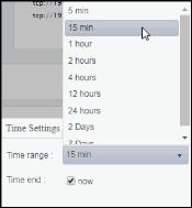
Select a time range from the drop down menu varying from 5 Minutes to Last 7 Days. By default, the time range end point is the current time.
To change the time range, deselect the now toggle, which displays some additional date fields. You can click the left and right arrow buttons to decrease the end time by one time period (the time selected in the Time range drop down) per click, or you can choose the date and time from the associated calendar and clock icons. You can also enter the date and time in the text field using the following format: MMM dd, YYYY HH:MM:ss. For example, Aug 21, 2018 12:24 PM. Click the now toggle to reset the time range end point to the current time.
|
|
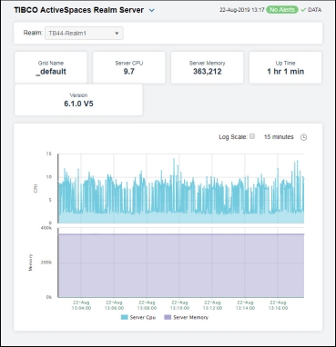
TIBCO ActiveSpaces Realm Server
Clicking Realm Server in the left/navigation menu opens the TIBCO ActiveSpaces Realm Server display, which provides a view of the current and historical metrics for the realm server of a single grid. Hover over the boxes at the top of the display to view additional information. In the trend graph region, you can view the server CPU percent usage and the server memory used (in KBs).
|
Filter By: The display might include these filtering options: |
||||
|
|
Realm |
Select the realm for which you want to show data in the display. |
||
|
Fields and Data: |
||||
|
|
Grid Name |
The name of the grid. |
||
|
|
Server CPU |
The server’s CPU usage percentage. |
||
|
|
Server Memory |
The used memory on the server, in kilobytes. |
||
|
|
Up Time |
The amount of time since the server was started. |
||
|
|
Version |
The version of the server. |
||
|
|
Trends |
Traces the following: Server CPU -- traces the server’s CPU usage percentage. Server Memory -- traces the used memory on the server. |
||
|
|
|
Log Scale |
Select to enable a logarithmic scale. Use Log Scale to see usage correlations for data with a wide range of values. For example, if a minority of your data is on a scale of tens, and a majority of your data is on a scale of thousands, the minority of your data is typically not visible in non-log scale graphs. Log Scale makes data on both scales visible by applying logarithmic values rather than actual values to the data. |
|
|
|
|
Time Settings |
Select a time range from the drop down menu varying from 5 Minutes to Last 7 Days. By default, the time range end point is the current time.
To change the time range, deselect the now toggle, which displays some additional date fields. You can click the left and right arrow buttons to decrease the end time by one time period (the time selected in the Time range drop down) per click, or you can choose the date and time from the associated calendar and clock icons. You can also enter the date and time in the text field using the following format: MMM dd, YYYY HH:MM:ss. For example, Aug 21, 2018 12:24 PM. Click the now toggle to reset the time range end point to the current time.
|
|
