Heatmaps organize your resources into rectangles and use color to highlight the most critical values in each. Heatmaps enable you to view various metrics in the same heatmap using drop-down menus. Each metric has a color gradient bar that maps relative values to colors. In most heatmaps, the rectangle size represents the number of resources in the rectangle; a larger size is a larger value. Heatmaps include drop-down menus to filter data by. The filtering options vary among heatmaps.
For example, each rectangle in the Proxy / Extend Overview heatmap represents a node, where color is representative of the selected Metric.
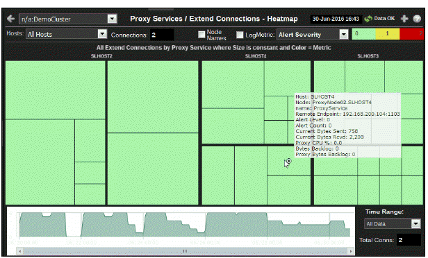
The Metric drop-down menu in this heatmap contains options to show Alert Severity, Alert Count, as well as other metrics. Menu options vary according to the data populating the heatmap. Alert Severity is selected and its corresponding color gradient  bar is shown. Alert Severity is the maximum level of alerts in the heatmap rectangle. Values range from 0 - 2, as indicated in the color gradient
  bar, where 2 is the highest Alert Severity:
 Red indicates that one or more services associated with that node currently has an alert in an alarm state.
 Yellow indicates that one or more services associated with that node currently have an alert in a warning state.
 Green indicates that no services associated with that node have alerts in a warning or alarm state.
In most heatmaps, you can also drill-down to a Summary display containing detailed data for the resource. You can also open a new window  and then drill-down. The drill-down opens a display that contains relevant and more detailed data.
The mouse-over functionality provides additional detailed data in an over imposed pop-up window when you mouse-over a heatmap. The following figure illustrates mouse-over functionality in a heatmap object.

Typically, heat maps provide the Log Scale option, which enables visualization on a logarithmic scale. This option should be used when the range in your data is very broad. For example, if you have data that ranges from the tens to the thousands, then data in the range of tens will be neglected visually if you do not check this option. This option makes data on both extreme ranges visible by using the logarithmic of the values rather than the actual values.