Monitor tables contain the same data that is shown in the heatmap in the same View. Tables provide you a text and numeric view of the data shown in that heatmap, and additional data not included the heatmap.
Tables support advanced HTML interactive features such as sorting on multiple columns, filtering on multiple columns, column resizing, column reordering, and hiding columns. Many of these features are accessed from the column menu, shown in the screen shot above, which you open by clicking on the menu icon in a column's header.
Some tables in the Components tab gray out rows when they’re in an expired state. A row is expired when data has not been received within the time specified in the solution package that is hosting the data.
Also see:
Click on a column header to sort the table by that column. On the first click, the column is sorted in ascending order (smallest value at the top), on the second click the sort is in descending order, and on the third click, the column is returned to its original unsorted state. A sort on a string column is case-insensitive.
To sort multiple columns, click on the column header for each column you want to sort. The sorting is performed in the order that the column headers were clicked. Multiple column sorting is a very useful feature, but can also cause confusion if you intend to sort on a single column, but forget to "unsort" any previously selected sort columns first. You should check for the up/down sort icon in other column headers if a sort gives unexpected results.
The grid's row selection is cleared if the sort is changed or if columns are resized or reordered.
Column sorting is reflected in an export to HTML and Excel.
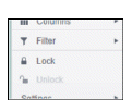
You can hide or show columns in the table by clicking on any column's menu icon, and choosing Columns from the menu. This opens a submenu with a check box for each column that toggles the visibility of the column. All columns in the data table appear in the Columns menu, even those that are initially hidden.
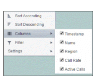
The leftmost column (the row header column) cannot be hidden.
Column visibility changes are NOT reflected in an export to HTML and Excel.
You can create a filter on any column. If filters are created on multiple columns, then only the rows that pass all of the filters are displayed. That is, if there are multiple filters they are logically "ANDed" together to produce the final result.
The background of a column's menu icon changes to white to indicate that a filter is defined on that column. This is intended to remind you which columns are filtered.
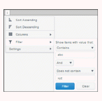
You can configure a filter on any column by clicking on the column's menu icon and choosing Filter from the menu. This opens the Column Filter dialog:
Options in the Column Filter dialog vary according to the data type of the selected column:
String columns: You can enter a filter string such as "abc" and, from the dropdown list, select the operator (equal to, not equal to, starts with, contains, etc) to be used when comparing the filter string to each string in the column. All of the filter comparisons on strings are case-insensitive. You can optionally enter a second filter string (e.g. "xyz") and specify if an AND or OR combination should be used to combine the first and second filter results on the column.
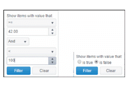
Numeric columns: You can enter numeric filter values and select arithmetic comparison operators, (=, !=, >, >=, <, <=). You can optionally enter a second filter value and comparison operator, and specify if an AND or OR combination should be used to combine the first and second filter results.
Boolean columns: You simply select whether matching items should be true or false.
The numeric and boolean filter dialogs are shown below.
Date columns: You can select a date and time and choose whether matching items should have a timestamp that is the same as, before, or after the filter time. The date is selected by clicking on the calendar icon and picking a date from a calendar dialog. The time is selected by clicking on the time icon and picking a time from a dropdown list:
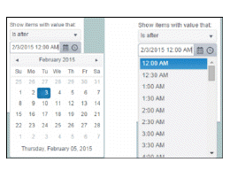
Alternatively, a date and time can be typed into the edit box. The strings shown in a date column are formatted by the Display Server using its time zone. But if a filter is specified on a date column, the date and time for the filter are computed using the client system's time zone. This can be confusing if the Display Server and client are in different time zones.
Data updates to the grid are suspended while the filter menu is opened. The updates are applied when the menu is closed.
Column filtering is reflected in an export to HTML and Excel.
The leftmost column is "locked" in position, meaning that it does not scroll horizontally with the other columns in the table. If the row header is enabled, then two items labeled Lock and Unlock appear in the column menu. These can be used to add or remove additional columns from the non-scrolling row header area.
If the row header is enabled, at least one column must remain locked.
Column locking is NOT reflected in an export to HTML and Excel.
You can reorder the grid columns by dragging and dropping a column's header into another position. Dragging a column into or out of the row header area (the leftmost columns) is equivalent to locking or unlocking the column.
Column reordering is NOT reflected in an export to HTML and Excel.
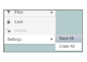
You can permanently save all of the custom settings made to the grid, including filtering, sorting, column size (width), column order, column visibility, and column locking. This is done by opening any column menu, clicking Settings, and then clicking Save All:
The grid's settings are written as an item in the browser's local storage. The item's value is a string containing the grid's settings. The item uses a unique key comprised of the URL path name, the display name, and the table's RTView object name. If the Thin Client's login feature is enabled, the key will also include the username and role, so different settings can be saved for each user and role for a grid on any given display, in the same browser and host.
If you save the grid settings and navigate away from the display or close the browser, then the next time you return to the display in the same browser the settings are retrieved from the browser's local storage and applied to the grid. The browser's local storage items are persistent, so the grid settings are preserved if the browser is closed and reopened or if the host system is restarted.
Note that each browser has its own local storage on each host. The local storage items are not shared between browsers on the same host or on different hosts. So, if a user logs in as Joe with role = admin, in Internet Explorer on host H1, and saves grid settings for display X, then those grid settings are restored each time a user logs in as Joe, role admin, on host H1 and opens display X in Internet Explorer. But if all the same is true except that the browser is Chrome, then the settings saved in Internet Explorer are not applied. Or if the user is Joe and role is admin and the browser is IE and the display is X, but the host system is H2 not H1, then the grid settings saved on H1 are not applied.
You can delete the grid's item from local storage by clicking Settings> Clear All in any column menu. This permanently deletes the saved settings for the grid and returns the grid to the state defined in the display file.
If the data table contains more than one 200 rows, page controls appear at the bottom of the grid.
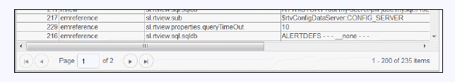
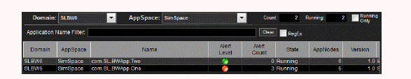
Table rows sometimes use color to indicate the current most critical alert state for all CIs associated with the row. In this example, the Severity Level column is sorted in descending order (from high to low values).
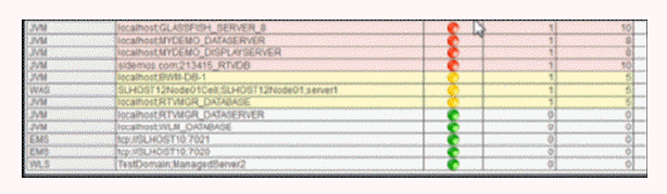
The yellow row color indicates that one or more alerts exceeded their warning threshold for one or more CIs associated with the Service. The red row color indicates that one or more alerts exceeded their critical threshold for the CI associated with the Service (in this case there is a single CI). To summarize:
|
Row Color Code: Tables with colored rows indicate the following: |
|
|
|
|
You can use the mouse to select a row and use the arrow keys to change the focus (highlighted) row, but to select the focus row, you must then press the space bar.
 Red indicates that one or more alerts exceeded their ALARM LEVEL threshold in the table row.
 Yellow indicates that one or more alerts exceeded their WARNING LEVEL threshold in the table row.
 Green indicates that no alerts exceeded their WARNING or ALARM LEVEL threshold in the table row.