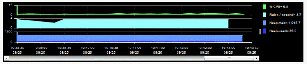
Monitor trend graphs enable you to view and compare performance metrics over time. You can use trend graphs to assess utilization and performance trends.
For example, the following figure illustrates a typical Monitor trend graph.
Select a time range from the drop down menu varying from 2 Minutes to Last 7 Days, or display All Data. By default, the time range end point is the current time.

To change the time range click Open Calendar  , choose the date and time, then click OK. Or enter the date and time in the text field using the following format: MMM dd, YYYY HH:MM:ss. For example, Aug 21, 2011 12:24 PM. Click Apply. Use the Navigation Arrows
  to move forward or backward one time period (the time period selected from the Time Range drop-down menu). Click Restore to Now to reset the time range end point to the current time.
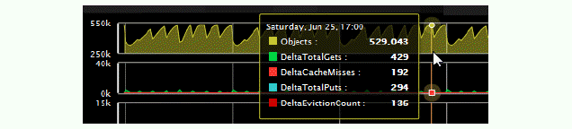
The mouse-over functionality provides additional detailed data in an over imposed pop-up window when you mouse-over trend graphs. The following figure illustrates mouse-over functionality. In this example, when you mouse-over a single dot, or data point, a pop-up window shows data for that data point.
Typically, trend graphs provide the Log Scale option. Log Scale enables you to see usage correlations for data with a wide range of values. For example, if a minority of your data is on a scale of tens, and a majority of your data is on a scale of thousands, the minority of your data is typically not visible in non-log scale graphs. Log Scale makes data on both scales visible by applying logarithmic values rather than actual values to the data.