Graphic Elements
This section describes the graphic objects that are used in displays and their behavior:
| • | Heatmaps |
| • | Tables |
| • | Trend Graphs |
| • | Icons and Buttons |
| • | Timestamps |
Heatmaps
Heatmaps organize your Solace PubSub+ resources (brokers, VPNs, Clients, Bridges, Endpoints and so forth) into rectangles and use color to highlight the most critical value in each. Heatmaps enable you to view various alert metrics in the same heatmap using drop-down menus. Each metric has a color gradient bar that maps relative values to colors. In most heatmaps, the rectangle size represents the number of resources in the rectangle; a larger size is a larger value. Heatmaps include drop-down menus by which to filter data. The filtering options vary among heatmaps (the Solace Brokers Heatmap is shown below).
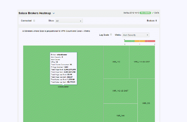
For example, the Solace Brokers Heatmap contains a Metric drop-down menu with options such as Alert Severity and Alert Count. Menu options vary according to the data populating the heatmap. Alert Severity is selected and its corresponding color gradient  bar is shown. Each rectangle represents a connection. A red rectangle in the heatmap indicates that one or more resources associated with that connection currently has an alert in an alarm state. The yellow rectangles in the heatmap indicate that one or more resources associated with that host currently have an alert in a warning state. A green rectangle would indicate that no alert is in a warning or alarm state.
In most heatmaps, you can also drill down to more detail by clicking a rectangle in the heatmap.
Note: Typically, it takes about 30 seconds after a server is started to appear in a Solace PubSub+ Monitor display. By default, data is collected every 15 seconds, and the display is refreshed 15 seconds afterward.
As previously mentioned, each Metric drop-down menu option has a color gradient bar that maps relative values to colors. The following summarizes the heatmap color code translation for typical heatmaps:
Alert Severity
The maximum alert level in the item (index) associated with the rectangle. Values range from 0 - 2, as indicated in the color gradient bar, where 2 is the highest Alert Severity.
 Metrics that have exceeded their specified ALARM LEVEL threshold have an Alert Severity value of 2. For a given rectangle, this indicates that one or more metrics have reached their alert thresholds.
 Metrics that have exceeded their specified WARNING LEVEL threshold have an Alert Severity value of 1. For a given rectangle, this indicates that one or more metrics have reached their warning thresholds.
 Metrics that have not exceeded either specified threshold have an Alert Severity value of 0. For a given rectangle, this indicates that no metrics have reached their warning or alert thresholds.
Alert Count
The total number of critical and warning alerts in a given item (index) associated with the rectangle. The color gradient bar  numerical values range from 0 to the maximum count of alerts currently in the heatmap. The middle value in the gradient bar indicates the average alert count.
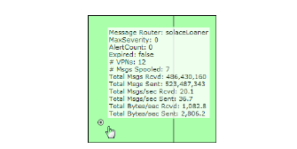
Mouse-over
The mouse-over functionality provides additional detailed data in a tool-tip when you mouse-over a heatmap. The following figure illustrates mouse-over functionality in a heatmap object. In this example, when you mouse-over a host, details are shown such as alert count, number of connections, and pending messages.
Tables
Solace PubSub+ Monitor tables contain the same data that is shown in the heatmap in the same View, and additional data not included in the heatmap. For example, the Solace Brokers Table display (shown below) shows the same data as the Solace Brokers Heatmap display. The following figure also illustrates the Column Visibility which allows you to select the columns you want in the table.
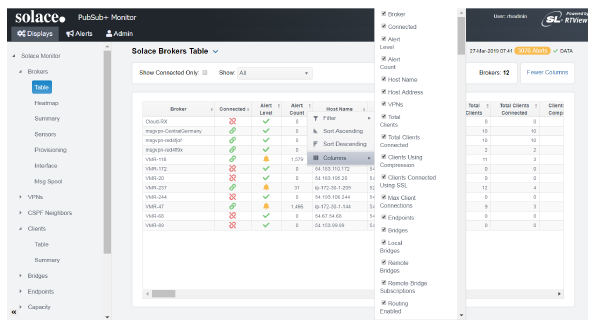
Tables support advanced HTML, interactive features: sorting on multiple columns, filtering on multiple columns, column resizing, column reordering, and hiding columns. Many of these features are accessed from the column menu, shown in the screen shot above, which you open by clicking on the menu icon in a column's header.
Additional features are:
Multiple Column Sorting
Click on a column header to sort the table by that column. On the first click, the column is sorted in ascending order (smallest value at the top), on the second click the sort is in descending order, and on the third click, the column is returned to its original unsorted state. A sort on a string column is case-sensitive.
To sort multiple columns, click on the column header for each column you want to sort. The sorting is performed in the order that the column headers were clicked. Multiple column sorting is a very useful feature, but can also cause confusion if you intend to sort on a single column, but forget to "unsort" any previously selected sort columns first. You should check for the up/down sort icon in other column headers if a sort gives unexpected results.
The grid's row selection is cleared if the sort is changed or if columns are resized or reordered.
Column sorting is reflected in an export to HTML and Excel.
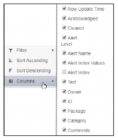
Column Visibility
You can hide or show columns in the table by clicking on any column's menu icon, and choosing Columns from the menu. This opens a submenu with a check box for each column that toggles the visibility of the column. All columns in the data table appear in the Columns menu, even those that are initially hidden.
Tip: If a table has twenty or more columns, the first check box in the list is labeled "Select All". A click on that checkbox will toggle the visibility of all columns. This can be useful when only a few columns of many are currently of interest. (Note that it is not possible to hide all columns, so at least one column will be visible).
Column visibility changes are NOT reflected in an export to HTML and Excel.
Column Filtering
You can create a filter on any column. If filters are created on multiple columns, then only the rows that pass all of the filters are displayed. That is, if there are multiple filters they are logically "ANDed" together to produce the final result.
You can configure a filter on any column by clicking on the column's menu icon and choosing Filter from the menu. This opens the Column Filter dialog:
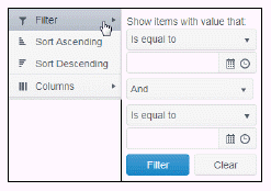
Options in the Column Filter dialog vary according to the data type of the selected column:
-
String columns: You can enter a filter string such as "abc" and, from the drop-down list, select the operator (equal to, not equal to, starts with, contains, etc) to be used when comparing the filter string to each string in the column. All of the filter comparisons on strings are case-insensitive. You can optionally enter a second filter string (e.g. "xyz") and specify if an AND or OR combination should be used to combine the first and second filter results on the column.
-
Numeric columns: You can enter numeric filter values and select arithmetic comparison operators, (=, !=, >, >=, <, <=). You can optionally enter a second filter value and comparison operator, and specify if an AND or OR combination should be used to combine the first and second filter results.
-
Boolean columns: You simply select whether matching items should be true or false.
-
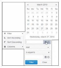
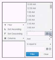
Date columns: You can select a date and time and choose whether matching items should have a timestamp that is the same as, before, or after the filter time. The date is selected by clicking on the calendar icon and picking a date from a calendar dialog. The time is selected by clicking on the time icon and picking a time from a drop-down list:
Data updates to the grid are suspended while the filter menu is opened. The updates are applied when the menu is closed.
Column filtering is reflected in an export to HTML and Excel.
If the row header is enabled, at least one column must remain locked.
Column locking is NOT reflected in an export to HTML and Excel.
Column Reordering
You can reorder the grid columns by dragging and dropping a column's header into another position. Dragging a column into or out of the row header area (the leftmost columns) is equivalent to locking or unlocking the column.
Column reordering is NOT reflected in an export to HTML and Excel.
Row Paging
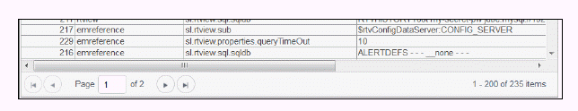
If the data table contains more than one 200 rows, page controls appear at the bottom of the grid.
Right-Click Exporting
Right-clicking on a table provides a context menu with three options: Export to Excel, Copy Cell Value, and Copy Column Names.
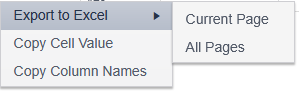
Export to Excel
Selecting this item generates an Export.xlsx file that is downloaded via your browser. You can select whether to export only the Current Page of data or All Pages. In some cases, the value of a cell in the spreadsheet may differ from the visible content. Examples are icons that represent true/false values, or decimals that only show a few places on the dashboard.
Copy Cell Value
Selecting this item copies the value of the cell to the clipboard. In some cases, the value of the cell may differ from the visible content. Examples are icons that represent true/false values, or decimals that only show a few places on the dashboard.
Copy Column Names
Selecting this item copies the table's visible column names, separated by newline, to the clipboard. If the Alt key is pressed, the data table's column names, rather than the visible column names (or "titles"), are copied to the clipboard.
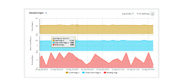
Trend Graphs
Solace PubSub+ Monitor trend graphs enable you to view and compare various important metrics over time, such as server memory and virtual memory utilization.
Time Settings
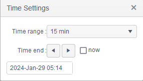
By default, the time range end point is the current time. To change the time range, click the Time Settings  and either:
-
choose a Time range from 5 Minutes to 7 Days in the drop-down menu.
-
specify begin/end dates using the calendar
 ..
.. -
specify begin/end time using the clock
 .
.
Toggle forward/backward in the trend graph per the period you choose (from the Time range drop-down menu) using arrows  .
.
Restore settings to current time by selecting now  .
.
Mouse-over
The mouse-over functionality provides additional detailed data in an over imposed pop-up window when you mouse-over trend graphs.
Log Scale
The Log Scale option enables visualization on a logarithmic scale. This option should be used when the range in your data is very broad. For example, if you have data that ranges from the tens to the thousands, then data in the range of tens will be neglected visually if you do not check this option. This option makes data on both extreme ranges visible by using the logarithmic of the values rather than the actual values.
Icons and Buttons
The following describes GUI icons and behavior in the title bar.
|
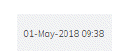
The current local date and time. If the time is incorrect, this might indicate that the monitor stopped running. When the date and time is correct and the Data indicator is green, this is a strong indication that the platform is receiving current and valid data.
|

|
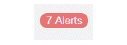
ALERTS: Opens the Alerts Table, shows the total number of alerts associated with items currently in the display as well as the maximum alert severity of these, where:
|
|
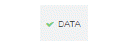
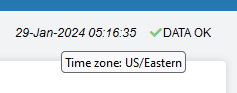
DATA: The data source is currently connected. When the date and time is correct and the DATA indicator is green, this is a strong indication that the platform is receiving current and valid data.
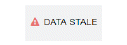
DATA STALE: The data source is currently disconnected. There has been no response from the Data Server for 31+ seconds. |
|
Log Scale |
Select to enable a logarithmic scale. Use Log Scale to see usage correlations for data with a wide range of values. For example, if a minority of your data is on a scale of tens, and a majority of your data is on a scale of thousands, the minority of your data is typically not visible in non-log scale graphs. Log Scale makes data on both scales visible by applying logarithmic values rather than actual values to the data. |
|
Drop-down menus filter the item/s you want to view. Options differ among displays. |


Timestamps
The HTML Monitor UI uses the time zone of the client browser to format all timestamps, even if the data server is in a different time zone.
The current date/time string is in the top right corner of most displays, in a plain (non-italic) font, but timestamps can also be found in table columns, on the time axis and tooltip of trend charts, and other date/time fields.
Client-Side Specification of Time zone
Users can change the time zone shown in their browser by right-clicking on the current date/time string shown in the top right corner of most displays. A dialog opens containing a text box where the user can enter the name of a time zone.
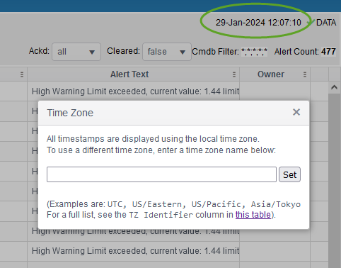
Examples are UTC, US/Pacific, Asia/Tokyo, etc.
Note: Some abbreviations, such as EST, listed in the Time zone abbreviation column might also be accepted, but that behavior will vary by specific browser and version.
After entering a time zone name, the user should click the Set button in the dialog. If the time zone name is not recognized, an error dialog is displayed and the time zone is not changed. If the user enters a time zone name that is recognized, and is not the same as the local time zone, the following occurs:
| • | The display is reloaded, and all timestamps are formatted using the selected time zone. This includes timestamps shown in table columns, on the time axis and tooltip of trend charts, and any other date/time field. |
| • | The current date/time string in the top right corner of the display is shown in italic font. |
| • | If the cursor hovers over the current date/time string, a tooltip appears showing the name of the selected time zone. |
The list of acceptable time zone names is shown in the second column (labeled "TZ Identifier") of the table here: https://en.wikipedia.org/wiki/List_of_tz_database_time_zones
| • | The date/time picker control (displayed when the user clicks on the clock icon on a trend, or selects the filter option on a time column in a table) only allows selection of a date/time via text entry. The popup calendar and the time dropdown list are not available. |
Important! The time zone selection is recorded in the browser's local storage. This means that it is persistent and will affect the monitor UI in all tabs opened in that browser. However it will not affect the time zone setting on any other users' systems.
Restore Default Behavior
To return to using the local time zone, the user can right click on the current date/time string in the top right corner, clear the string in the text box, and click the Set button. This restores the default behavior to the monitor UI, namely:
| • | The display is reloaded, and all data timestamps are formatted using the local time zone. |
| • | The current date/time string in the top right corner of the display is shown in plain (non-italic) font. |
| • | If the cursor hovers over the current date/time string, no tooltip appears. |
| • | The date/time picker control allows selection of a date/time via text entry or via the popup calendar or the time dropdown list. |