 Red indicates that one or more metrics exceeded their ALARM LEVEL threshold.
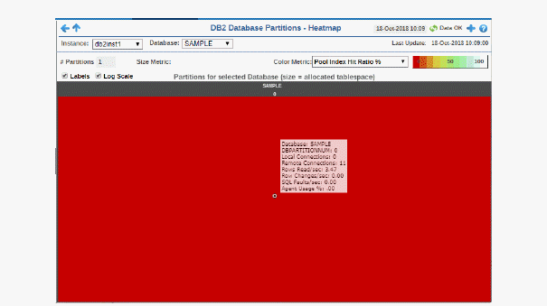
View current alert status and performance metrics of all partitions on a DB2 database.
Answer questions such as, Are any partitions on this database reaching a state of critical health? Do I need to allocate more tablespace to any partitions? Is processing load and number of connections evenly distributed across partitions?
Each rectangle in the heatmap represents a different partition, where the rectangle color indicates the most critical alert state for items associated with that partition, and the rectangle size represents the tablespace allocation size for the partition.
Select an Instance and a Database. Use the Metric drop-down menu to view Rows Read Per Second, Rollbacks Per Second and Dirty Steel Triggers/K-Trans, among many others.
Each metric has its own color gradient bar legend that maps values to colors. By default, the Commits/sec metric is shown, which is the number of commits per second for the partition. Values range from 0 to the maximum number in the heatmap, as indicated in the color gradient bar:
Red indicates that one or more metrics exceeded their ALARM LEVEL threshold.
 Yellow indicates that one or more metrics exceeded their WARNING LEVEL threshold.
 Green indicates that no metrics have exceeded their alert thresholds.
Use the Labels check-box  to include or exclude labels in the heatmap, use the Log Scale check-box
  to apply log scale and mouse over a rectangle to see additional metrics. Click a rectangle to see performance metrics for the database in which the partition resides in the Database Summary display.
|
Fields and Data: |
||||
|
|
Labels |
Select this check box to display the names of the instances at the top of each rectangle in the heatmap. |
||
|
|
Log |
Select to this check box to enable a logarithmic scale. Use Log Scale to see usage correlations for data with a wide range of values. For example, if a minority of your data is on a scale of tens, and a majority of your data is on a scale of thousands, the minority of your data is typically not visible in non-log scale graphs. Log Scale makes data on both scales visible by applying logarithmic values rather than actual values to the data. |
||
|
|
Auto |
Select to enable auto-scaling. When auto-scaling is activated, the color gradient bar's maximum range displays the highest value. Note: Some metrics auto-scale automatically, even when Auto is not selected. |
||
|
|
Metric |
Choose a metric to view in the display. Each rectangle in the heatmap represents a different partition on the selected database. For additional details about the data, refer to vendor documentation. |
||
|
|
|
Commits/sec |
The number of application commits per second. The color gradient bar
|
|
|
|
|
Pool Index Hit Ratio % |
The average response time, in milliseconds, for items associated with the rectangle. The color gradient bar
|
|
|
|
|
SQL Failures/sec |
The number of SQL faults per second. The color gradient bar
|
|
|
|
|
Rows Read /sec |
The number of rows read per second. The color gradient bar
|
|
|
|
|
Rows Selected /sec |
The number of rows selected per second. The color gradient bar
|
|
|
|
|
Rows Changed /sec |
The number of rows changed per second. The color gradient bar
|
|
|
|
|
SQL Select Stmts/sec |
The number of SQL statements selected per second. The color gradient bar
|
|
|
|
|
Rollbacks/sec |
The number of rollbacks per second. The color gradient
|
|
|
|
|
SQL Update/Del/Ins/Stmts /sec |
The number of SQL updates, deletions, insertions and statements per second. The color gradient
|
|
 shows the range of the value/color mapping. By default, the numerical values in the gradient bar range from


 shows the range of the value/color mapping. By default, the numerical values in the gradient bar range from


 shows the range of the value/color mapping. By default, the numerical values in the gradient bar range from


 shows the range of the value/color mapping. By default, the numerical values in the gradient bar range from


 shows the range of the value/color mapping. By default, the numerical values in the gradient bar range from


 shows the range of the value/color mapping. By default, the numerical values in the gradient bar range from


 shows the range of the value/color mapping. By default, the numerical values in the gradient bar range from


