|
Fields and Data:
|
|
|
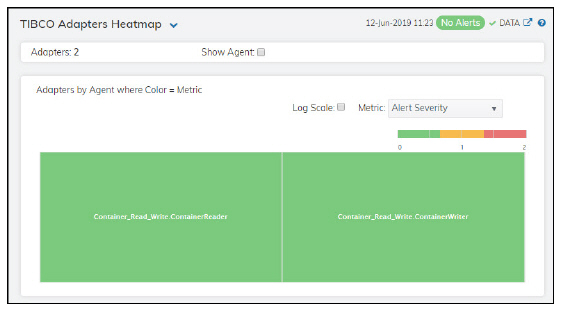
Adapters
|
The number of adapters included in the display.
|
|
|
Show Agent
|
Select this check box to display the names of the agents at the top of each rectangle in the heatmap.
|
|
|
Log Scale
|
Select this check box to enable a logarithmic scale. Use Log Scale to see usage correlations for data with a wide range of values. For example, if a minority of your data is on a scale of tens, and a majority of your data is on a scale of thousands, the minority of your data is typically not visible in non-log scale graphs. Log Scale makes data on both scales visible by applying logarithmic values rather than actual values to the data.
|
|
|
Auto Scale
|
Select to enable auto-scaling. When auto-scaling is activated, the color gradient bar's maximum range displays the highest value.
Note: Some metrics auto-scale automatically, even when Auto Scale is not selected.
|
|
|
Metric
|
Select the metric driving the heatmap display. The default is Alert Severity. Each Metric has a color gradient bar that maps values to colors. The heatmap organizes the servers by agent, where each rectangle represents an adapter. Mouse-over any rectangle to display the current values of the metrics for the adapter. Click on a rectangle to drill-down to the associated TIBCO Adapter Summary display for a detailed view of metrics for that particular adapter.
|
|
|
|
Alert Severity
|
The current alert severity. Values range from 0 - 2, as indicated in the color gradient  bar, where 2 is the highest Alert Severity: bar, where 2 is the highest Alert Severity:
 Red indicates that one or more metrics exceeded their ALARM LEVEL threshold. Red indicates that one or more metrics exceeded their ALARM LEVEL threshold.
 Yellow indicates that one or more metrics exceeded their WARNING LEVEL threshold. Yellow indicates that one or more metrics exceeded their WARNING LEVEL threshold.
 Green indicates that no metrics have exceeded their alert thresholds. Green indicates that no metrics have exceeded their alert thresholds.
|
|
|
|
Alert Count
|
The total number of critical and warning unacknowledged alerts in the adapters. The color gradient  bar, populated by the current heatmap, shows the value/color mapping. The numerical values in the gradient bar range from 0 to the maximum count of alerts in the heatmap. The middle value in the gradient bar indicates the average alert count. bar, populated by the current heatmap, shows the value/color mapping. The numerical values in the gradient bar range from 0 to the maximum count of alerts in the heatmap. The middle value in the gradient bar indicates the average alert count.
|
|
|
|
Sent Msgs/s
|
The number of message sent per second. The color gradient bar  shows the range of the value/color mapping. ated by the current heatmap, shows the value/color mapping. The numerical values in the gradient bar range from 0 to the defined alert threshold of TadAdapterMsgsSentRateHigh. The middle value in the gradient bar indicates the middle value of the range. shows the range of the value/color mapping. ated by the current heatmap, shows the value/color mapping. The numerical values in the gradient bar range from 0 to the defined alert threshold of TadAdapterMsgsSentRateHigh. The middle value in the gradient bar indicates the middle value of the range.
When Auto Scale is checked, the numeric values in the color gradient bar show the range of the data being displayed rather than the default values. The middle value changes accordingly to indicate the color of the middle value of the range.
|
|
|
|
Received Msgs/s
|
The number of messages received per second. The color gradient  bar, populated by the current heatmap, shows the value/color mapping. The numerical values in the gradient bar range from 0 to the defined alert threshold of TadAdapterMsgsRcvdRateHigh. The middle value in the gradient bar indicates the middle value of the range. bar, populated by the current heatmap, shows the value/color mapping. The numerical values in the gradient bar range from 0 to the defined alert threshold of TadAdapterMsgsRcvdRateHigh. The middle value in the gradient bar indicates the middle value of the range.
When Auto Scale is checked, the numeric values in the color gradient bar show the range of the data being displayed rather than the default values. The middle value changes accordingly to indicate the color of the middle value of the range.
|
|
|
|
Current Sent Msgs
|
The increase in the number of messages sent (per second) from the previous polling period to the current polling period. The color gradient  bar, populated by the current heatmap, shows the value/color mapping. The numerical values in the gradient bar range from 0 to the maximum number of messages sent. The middle value in the gradient bar indicates the middle value of the range. bar, populated by the current heatmap, shows the value/color mapping. The numerical values in the gradient bar range from 0 to the maximum number of messages sent. The middle value in the gradient bar indicates the middle value of the range.
The Auto Scale check box does not impact this metric.
|
|
|
|
Current Received Msgs
|
The increase in the number of messages received (per second) from the previous polling period to the current polling period. The color gradient  bar, populated by the current heatmap, shows the value/color mapping. The numerical values in the gradient bar range from 0 to the maximum number of messages received. The middle value in the gradient bar indicates the middle value of the range. bar, populated by the current heatmap, shows the value/color mapping. The numerical values in the gradient bar range from 0 to the maximum number of messages received. The middle value in the gradient bar indicates the middle value of the range.
The Auto Scale check box does not impact this metric.
|
|
|
|
Current Errors
|
The increase in the number of errors from the previous polling period to the current polling period. The color gradient  bar, populated by the current heatmap, shows the value/color mapping. The numerical values in the gradient bar range from 0 to the defined alert threshold of TadAdapterDeltaErrorsHigh. The middle value in the gradient bar indicates the middle value of the range. bar, populated by the current heatmap, shows the value/color mapping. The numerical values in the gradient bar range from 0 to the defined alert threshold of TadAdapterDeltaErrorsHigh. The middle value in the gradient bar indicates the middle value of the range.
When Auto Scale is checked, the numeric values in the color gradient bar show the range of the data being displayed rather than the default values. The middle value changes accordingly to indicate the color of the middle value of the range.
|
 to include or exclude labels in the heatmap, and you can mouse over a rectangle to see additional metrics for an adapter. Drill-down and investigate an engine by clicking a rectangle in the heatmap to view details in the TIBCO Adapter Summary display.