|
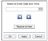
Select a time range from the drop down menu varying from 2 Minutes to Last 7 Days, or display All Data. By default, the time range end point is the current time.
To change the time range for the graph, click Open Calendar  , choose the date and time, then click OK. Or enter the date and time in the text field using the following format: MMM dd, YYYY HH:MM. For example, Aug 21, 2011 12:24 PM. , choose the date and time, then click OK. Or enter the date and time in the text field using the following format: MMM dd, YYYY HH:MM. For example, Aug 21, 2011 12:24 PM.
Use the navigation arrows  to move forward or backward one time period. NOTE: The time period is determined by your selection from the Time Range drop-down menu. to move forward or backward one time period. NOTE: The time period is determined by your selection from the Time Range drop-down menu.
Click Restore to Now to reset the time range end point to the current time.
|
 to include or exclude labels in the heatmap. Drill-down and investigate by clicking a row in the heatmap to view details in the last display that was viewed under either the Service Summary Views or Key Metric Views. For example, if the last selected display was the Service Summary display under Service Summary Views and you clicked on a row in the Services History Heatmap, the details would display in the Service Summary display. If the last selected display was the Service KM Table display under Key Metrics Views, then clicking a row in the Services History Heatmap displays the details in the Service KM Table.
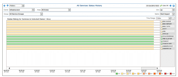

 Red indicates that one or more alerts exceeded their ALARM LEVEL threshold in the row.
 Yellow indicates that one or more alerts exceeded their WARNING LEVEL threshold in the row.
 Green indicates that no alerts exceeded their WARNING or ALARM LEVEL threshold in the row.