Cluster Views displays present high-level performance metrics for the cluster. Use the Cluster Views displays to quickly assess Coherence cluster-level performance metrics.
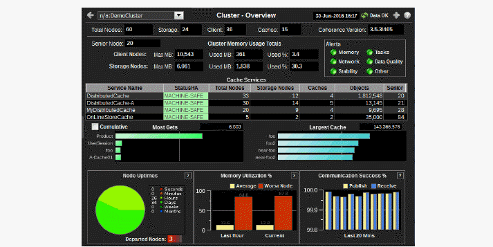
Cluster - Overview: Quickly assess general cluster stability, cluster size (number of nodes, clients and caches), service and cache capacity utilization/distribution and HA status.
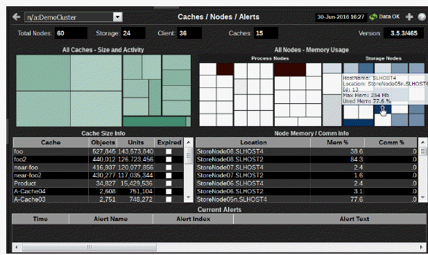
Caches / Nodes / Alerts: View cache and node utilization hot spots and currently active alerts.
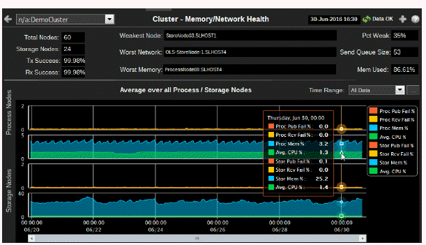
Memory/Network Health: Assess cluster memory utilization and packet transmission success/failure trends, and see weakest nodes.
Stability Metrics: Troubleshoot nodes joining and leaving the cluster, view HA status for cache services.
All Services History: Assess capacity utilization, over time, by all services in a cluster.
All Caches History: Assess capacity utilization and distribution for all caches in a cluster, and quickly identify potential bottlenecks.
All Nodes History: Assess capacity utilization, over time, for all nodes in a cluster.
Use this display to quickly assess the cluster size (number of nodes, clients and caches) and stability, service and cache capacity utilization and HA status. This display is the initial view in the Monitor.
Choose a cluster from the drop down menu. Check the Communication Success% bar charts for cluster packet loss. If the pairs of bar graphs are uneven, this indicates that packet loss is occurring. The cause for the packet loss could be a network issue, a single defective NIC card, a garbage collection issue, disk swapping or a shortage of CPU on a single machine. Investigate further by clicking the bar chart to view details in the Cluster - Memory/Network Health display.
|
Fields and Data: |
||||
|
|
Coherence Cluster Configuration |
|||
|
|
Total Nodes |
Total number of nodes being monitored, including storage enabled nodes, client nodes, and management (JMX) nodes. |
||
|
|
Storage |
Total number of nodes in the cluster which have storage enabled for any cache. This value is equal to the total nodes when replicated caches are being used. The number is less when only distributed cache types are utilized. |
||
|
|
Clients |
Total number of nodes in the cluster which do not have storage enabled for any cache. These are usually process nodes, proxy nodes, extend nodes, or MBean server nodes. |
||
|
|
Caches |
Total number of caches in the cluster. |
||
|
|
Version |
Version of Oracle Coherence running. |
||
|
|
Cluster Memory Usage Totals |
|||
|
|
Senior Node |
Node ID of the senior node of the cluster. |
||
|
|
Client Nodes |
Monitor client node memory utilization for the cluster. |
||
|
|
|
Max MB |
Total memory allocated. |
|
|
|
|
Used MB |
Total memory used. |
|
|
|
|
% |
Percent of allocated memory being used. |
|
|
|
Storage Nodes |
Monitor storage node memory utilization for the cluster. |
||
|
|
|
Max MB |
Total memory allocated. |
|
|
|
|
Used MB |
Total memory used. |
|
|
|
|
% |
Percent of allocated memory being used |
|
|
|
Alert Severity |
The maximum level of alerts for all nodes in the cluster. Click to drill down to the Alert Detail Table.
|
||
|
|
|
Memory |
Represents the current most critical state of alerts related to heap and memory alerts for all nodes in the cluster. For example, the AvailableMemoryLowNode alert. |
|
|
|
|
Network |
Represents the current most critical state of alerts related to network and communication protocols for all nodes in the cluster. For example, the BadCommunicationCluster alert. |
|
|
|
|
Stability |
Represents the current most critical state of alerts related to cluster stability for all nodes in the cluster. For example, the DepartedNodePercentage alert. |
|
|
|
|
Tasks |
Represents the current most critical state of alerts related to queries, entry processors and invocations for all nodes in the cluster. For example, the HighTaskBacklogNode alert. |
|
|
|
|
Data Quality |
Represents the current most critical state of alerts related to the quality of data in the Data Server for all nodes in the cluster. For example, the JmxProcessingTime alert. |
|
|
|
|
Other |
Represents the current most critical state of alerts related to all alerts not represented in the other five status indicators for all nodes in the cluster. For example, the CapacityLimiitAllCaches alert. |
|
|
|
|
Memory |
Represents the current most critical state of alerts related to heap and memory alerts for all nodes in the cluster. For example, the AvailableMemoryLowNode alert. |
|
|
|
Service Configuration & HA Status |
|||
|
|
Cache Services |
Assess size, distribution and status of Coherence protocol-related cache services used by applications in the cluster. Determine whether cache services are distributed properly across the cluster. The list includes distributed, replicated and mirrored caches. Note that Management and Invocation services are intentionally not listed. |
||
|
|
|
Service Name |
The name of the service in the cluster. These are defined in each server cache configuration XML file. |
|
|
|
|
StatusHA |
The high availability status for each of the services. |
|
|
|
|
|
MACHINE-SAFE |
If a machine for the service goes offline the data stored on the machine remains available in the cluster (no data loss). |
|
|
|
|
NODE-SAFE |
If a node for the service goes offline (or is taken offline using kill-9) data stored on the node remains available in the cluster (no data loss). |
|
|
|
|
ENDANGERED |
If a node for the service goes offline the data stored on the node is potentially unavailable in the cluster (potential data loss). |
|
|
|
Total Nodes |
The number of nodes in the cluster that are running a thread for the service. |
|
|
|
|
Storage Nodes |
The number of nodes for the service where storage is enabled. |
|
|
|
|
Caches |
The number of caches for the service. |
|
|
|
|
Objects |
The number of objects in all caches for the service. |
|
|
|
|
Senior |
The node ID of the most senior node in the cluster for the service. |
|
|
|
Caches - Busiest & Largest |
|||
|
|
Most Gets |
Track services performing the greatest number of gets in the cluster. The total is the number of gets by nodes in the cluster since the last sample was retrieved. Click to drill-down to the All Caches - Current Activity Chart display. |
||
|
|
Cumulative |
Select the checkbox to show only the cumulative total for all nodes for the service since they started in the Most Gets bar chart. |
||
|
|
Largest Cache |
Track caches that consume the greatest amount of capacity. Click to drill-down to the All Caches - Current Size Chart display. |
||
|
|
Cluster Stability |
|||
|
|
Node Uptimes |
Monitor cluster stability and how often nodes are restarted (for example, every month, every day, every hour, and so forth). If the number of nodes running for seconds of time increases (and your nodes are restarted weekly), consider investigating. Click in the Node Uptimes region to view details on the Stability Metrics display. Solid colors in the graph indicate the amount of time since the nodes were started. Longer uptimes generally represent a more stable cluster. Departed Nodes specifies the number of nodes that have departed and not returned since monitoring of the cluster was started. If a node departs and returns with the same name, the count is decremented. |
||
|
|
Memory Utilization% |
Monitor memory utilization for all nodes in the cluster. |
||
|
|
|
Average |
The average memory utilization for all nodes in the cluster. |
|
|
|
|
Worst Node |
The most amount of memory consumed by a single node in the cluster. A slow node that provides data to other nodes can cause latency issues for the entire cluster. If a node is consuming too much memory, investigate by clicking the bar chart to view details in the Cluster - Memory/Network Health display. |
|
|
|
Communication Success% |
Monitor cluster packet loss--an excellent indicator of systemic issues in the cluster. If the pairs of bar graphs are uneven, this indicates that packet loss is occurring and analysis is needed. Investigate further by clicking the bar chart to view details in the Cluster - Memory/Network Health display. The bar charts show the percent (%) successful UDP packet transfers in the cluster for the last twenty minutes. Each pair of bars show the Publish and Receive success rates for all nodes in the cluster. Compare each pair of Publish and Receive bars. The bars should have similar rates. If they do not have similar rates this indicates packet loss in the cluster. For example, if the Publish success rate is much lower than the Receive success rate, packets are being resent and the receiver is not getting them. Compare and track the pairs of bars across twenty minutes. The bars should track evenly. If the bars do not track evenly this also is a sign of packet loss in the cluster. The cause for the packet loss could be a network issue, a single defective NIC card, a garbage collection issue, disk swapping or a shortage of CPU on a single machine. |
||
|
|
|
Publish |
The Publish success rate is the percent (%) of packets in the cluster successfully sent by nodes, without having to be resent. A 100% success rate occurs when a packet is sent and does not have to be re-sent. When a packet must be resent the success rate is reduced. |
|
|
|
|
Receive |
The Receive success rate is the percent (%) of packets in the cluster successfully received by nodes, without being received twice. A 100% success rate occurs when a packet is received once. When a packet is received twice the success rate is reduced. |
|
Use this display to view cache and node utilization hot spots and currently active alerts. Observe how much capacity is taken from memory and how much is taken from consumption. Identify caches and nodes that are slow due to a shortage of capacity or memory. Verify nodes are configured properly (using the mouseover tool-tip). View time-ordered list of current alerts in the cluster.

|
Fields and Data: |
||||
|
|
Total Nodes |
Total number of nodes being monitored, including storage enabled nodes, client nodes, and management (JMX) nodes. |
||
|
|
Storage |
Total number of nodes in the cluster which have storage enabled for any cache. This value is equal to the total nodes when replicated caches are being used. The number is less when only distributed cache types are utilized. |
||
|
|
Clients |
Total number of nodes in the cluster which do not have storage enabled for any cache. These are usually process nodes, proxy nodes, extend nodes, or MBean server nodes. |
||
|
|
Caches |
Total number of caches in the cluster. |
||
|
|
Version |
Version of Oracle Coherence running. |
||
|
|
Capacity & Memory Usage |
|||
|
|
All Caches - Size and Activity |
Use the heatmap to identify a cache with high capacity or memory usage, indicated by a dark rectangle. Observe how much capacity is taken from memory and how much is taken from consumption. View cache metrics using the mouseover tool-tip. Investigate cache utilization trends over time in the All Caches History display. Click on a rectangle to drill-down to the All Caches - All Caches Heatmap. The heatmap is grouped by service. Each rectangle represents a cache within the service. The size of each rectangle represents the size of a cache in units. The color of each rectangle represents the number of gets on the cache. The color is linearly scaled, where white is the minimum gets seen and dark green is the maximum gets seen. |
||
|
|
|
Cache Size Info |
The table lists each cache in the cluster and enables you to sort the by most/least amount of objects or units. Click a row to view details in the Single Cache Summary display. |
|
|
|
|
Cache |
The name of the cache. |
|
|
|
|
Objects |
The number of objects currently in the cache. |
|
|
|
|
Units |
The number of units currently used by the cache. |
|
|
|
All Nodes- Memory Usage |
Use the heatmap to identify a node with high memory usage, indicated by a dark rectangle. Verify nodes are configured properly using the mouseover tool-tip. Click on a rectangle to drill-down to the All Nodes by Type/Host/Memory. The heatmap is divided into two sections: Process Nodes and Storage Nodes. Each rectangle represents a node in the cluster. The size of the rectangle represents the value of the maximum node memory. The color of the rectangle represents the value of the memory used. The color is linearly scaled, where white is 0% memory used and dark green is 80% memory used. |
||
|
|
|
Node Memory/Comm Info |
The table lists each node in the cluster and enables you to sort the by most/least amount of objects or units. Click a row to view details in the Node Summary display. |
|
|
|
|
|
Location |
A unique identifier for each node. It is defined as: member_name.machine.rack.site. |
|
|
|
|
Mem% |
The percent memory utilization for the node. |
|
|
|
|
Comm% |
The percent memory utilization used for packet transfer by the node. |
|
|
All Active Alerts (in selected cluster) |
|||
|
|
Current Alerts |
The table lists all alerts for all sources (nodes and caches) in the selected cluster that have exceeded an alert threshold. Sort the data by column using the button. By default, critical and warning alerts are shown. Select an alert in the list to open the Alert Detail Table dialog and acknowledge an alert or add comments. Where:
For details about alerts, see Appendix, Alert Definitions. |
||
|
|
|
Alert Name |
The alert type. Alert Types contain alert threshold definitions. A single alert type applies to all nodes or caches in the cluster. For example, the OcAvailableMemoryLowNodeSpike alert type applies to multiple nodes, and the OcCapacityLimitCache alert type applies to multiple caches. (The Alert Index identifies the source node for the alert.) For details about alerts, see Appendix, Alert Definitions. |
|
|
|
|
Alert Index |
The Oracle Coherence source (node or cache) from which the alert originated. As with nodes, a cluster can have multiple caches. A single alert type, such as OcCapacityLimitCache, applies to all caches in the cluster. The Alert Index identifies the cache from which the alert originated. |
|
|
|
|
Alert Text |
Descriptive information about the alert. |
|
|
|
|
Cleared |
The checkbox is selected if this alert has cleared. An alert is considered cleared when the source for the alert (node or cache) returns to below the alert threshold. To include acknowledged alerts in the table, select Show Cleared. |
|
|
|
|
Acknowledged |
The checkbox is selected if this alert has been acknowledged. Acknowledged alerts have been manually acknowledged by an administrator. Acknowledged alerts are automatically removed from the Current Alerts table. To include acknowledged alerts in the table, select Show Acknowledged. |
|
|
|
|
ID |
Unique ID for the alert. |
|
|
|
|
Comments |
Comments about the alert previously entered by an administrator. |
|
|
|
|
Cleared Reason |
An alert is in a cleared state when the source for the alert (node or cache) returns to below the alert threshold. Or, with the OcDepartedNode alert type, when the node rejoins the cluster the alert is cleared. |
|
|
|
|
Cleared Time |
The time the alert was cleared. |
|
|
|
|
Alert Index Value |
The Oracle Coherence source (node or cache) from which the alert originated. |
|
|
|
|
Cluster Connection |
The name of the cluster in which the alert source (node or cache) is a member. |
|
Use this display to assess cluster memory utilization and packet transmission success/failure trends, and to see the weakest nodes.

|
Fields and Data: |
||||
|
|
Total Nodes |
The total number of nodes in the cluster. This includes storage enabled nodes, client nodes, and management (JMX) nodes. |
||
|
|
Storage Nodes |
The total number of nodes in the cluster which have storage enabled for any cache. This value is equal to the total nodes when replicated caches are being used. The number is less when only distributed cache types are utilized. |
||
|
|
Tx Success |
The publisher success rate, in percent. The Publish success rate is the percent (%) of packets in the cluster successfully sent by nodes, without having to be resent. A 100% success rate occurs when a packet is sent and does not have to be re-sent. When a packet must be resent the success rate is reduced. |
||
|
|
Rx Success |
The receiver success rate, in percent. The Receive success rate is the percent (%) of packets in the cluster successfully received by nodes, without being received twice. A 100% success rate occurs when a packet is received once. When a packet is received twice the success rate is reduced. |
||
|
|
Weakest Node |
The node voted by Coherence as the weakest in the cluster. The Weakest Node often points to a server/node that is causing performance issues. The node value most often appears in the "weakest node" attribute of all the JMX "node" objects. The format of this string is <Node IP Address>:< Node Port >/<NodeID>. |
||
|
|
|
Weak |
The percent of the Coherence nodes that "elected" the node as the weakest. |
|
|
|
Worst Network |
The node that has the longest network queue in the cluster. |
||
|
|
|
Send Queue |
The number of packets currently scheduled for delivery, including packets sent and still awaiting acknowledgment. Packets that do not receive an acknowledgment within the ResendDelay interval are automatically resent. |
|
|
|
Worst Memory |
The node that has the lowest available memory of any node in the cluster. |
||
|
|
|
Mem Used |
The percent of memory consumed on the Worst Memory node. |
|
|
|
Average over all Process / Storage Nodes |
Trend Graphs |
||
|
|
|
Time Range |
Select a time range from the drop down menu varying from 2 Minutes to Last 7 Days, or display All Data. To specify a time range, click Calendar 
By default, the time range end point is the current time. To change the time range end point, click Calendar Use the navigation arrows Click Restore to Now to reset the time range end point to the current time.
|
|
|
|
|
Process Nodes |
Publish Failures and Received Failures |
Indicates the trending of process node publisher and receiver failure rates. If these values are above 10%, action may be required to improve the stability or performance of the cluster as a whole. The Weakest Node information often points to the server/nodes that are the cause of these issues. |
|
|
|
|
Memory Utilization% |
Indicates the trending of process node memory utilization. If these values are above 10%, action may be required to improve the stability or performance of the cluster as a whole. |
|
|
|
Storage Nodes |
Publish Failures and Received Failures |
Indicates the trending of storage node publisher and receiver failure rates. If these values are above 10%, action may be required to improve the stability or performance of the cluster as a whole. The Weakest Node information often points to the server/nodes that are the cause of these issues. |
|
|
|
|
Memory Utilization% |
Indicates the trending of storage node memory utilization. If these values are above 10%, action may be required to improve the stability or performance of the cluster as a whole. |
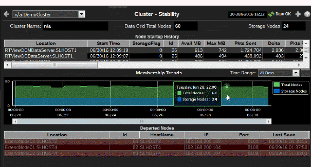
Use this display to troubleshoot nodes joining and leaving the cluster, and view HA status for cache services. This display presents information about node up times and the stability of the cluster.

|
Fields and Data: |
||||
|
|
Cluster Name |
Select a cluster from the drop-down menu. |
||
|
|
Data Grid Total Nodes |
The total number of nodes being monitored. This includes storage enabled nodes, client nodes, and management (JMX) nodes. |
||
|
|
Storage Nodes |
The total number of nodes in the cluster which have storage enabled for any cache. This value is equal to the total nodes when replicated caches are being used. The number is less when only distributed cache types are utilized. |
||
|
|
Node Startup History |
Use this table to identify nodes that have departed and returned to the cluster recently. This table contains a list of nodes in the cluster, sorted by start time (the most recently created node is listed first). |
||
|
|
|
Location |
A unique identifier for each node. It is defined as: member_name.machine.rack.site. |
|
|
|
|
Start Time |
The date and time that the node joined the cluster. |
|
|
|
|
StorageFlag |
Indicates whether storage is enabled (0 or 1). |
|
|
|
|
Id |
The short member id that uniquely identifies this member. |
|
|
|
|
Avail MB |
The amount of available memory for this node, in megabytes. |
|
|
|
|
Max MB |
The maximum amount of memory for this node, in megabytes. |
|
|
|
|
Pkts Sent |
The cumulative number of packets sent by this node since the node statistics were last reset. |
|
|
|
|
Delta |
The number of packets sent by this node since the last update. |
|
|
|
|
Pkts Rcvd |
The cumulative number of packets received by this node since the node statistics were last reset. |
|
|
|
|
Delta |
The number of packets received by this node since the last update. |
|
|
|
|
Pkts Rptd |
The cumulative number of duplicate packets received by this node since the node statistics were last reset. |
|
|
|
|
Delta |
The number of duplicate packets received by this node since the last update. |
|
|
|
|
Pkts Resent |
The cumulative number of packets resent by this node since the node statistics were last reset. |
|
|
|
|
Delta |
The number of packets resent by this node since the last update. |
|
|
|
|
Pub Succ Rate |
The publisher success rate for this node since the node statistics were last reset. Publisher success rate is a ratio of the number of packets successfully delivered in a first attempt to the total number of sent packets. A failure count is incremented when there is no ACK received within a timeout period. It could be caused by either very high network latency or a high packet drop rate. |
|
|
|
|
Rec Succ Rate |
The receiver success rate for this node since the node statistics were last reset. Receiver success rate is a ratio of the number of packets successfully acknowledged in a first attempt to the total number of received packets. A failure count is incremented when a re-delivery of previously received packet is detected. It could be caused by either very high inbound network latency or lost ACK packets. |
|
|
|
|
Member |
The member name for this node. |
|
|
|
|
Machine |
The machine name for this node. |
|
|
|
|
Rack |
The rack name for this node. |
|
|
|
|
Site |
The site name for this node. |
|
|
|
|
Process |
The process name for this node. |
|
|
|
|
Uni Addr |
The unicast address. This is the IP address of the node's DatagramSocket for point-to-point communication. |
|
|
|
|
Uni Port |
The unicast port. This is the port of the node's DatagramSocket for point-to-point communication. |
|
|
|
|
RoleName |
The role name for this node. |
|
|
|
|
Product-Edition |
The product edition this node is running. Possible values are: Standard Edition (SE), Enterprise Edition (EE), Grid Edition (GE). |
|
|
|
Membership Trends |
Track the total number of nodes and the total number of storage nodes in the cluster for the duration of the user session. These lines are normally unchanging or "flat". If there are fluctuations in this graph, check the debugging guide for appropriate actions. |
||
|
|
|
Time Range |
Select a time range from the drop down menu varying from 2 Minutes to Last 7 Days, or display All Data. To specify a time range, click Calendar 
By default, the time range end point is the current time. To change the time range end point, click Calendar Use the navigation arrows Click Restore to Now to reset the time range end point to the current time.
|
|
|
|
Departed Nodes |
Track departed nodes by IP address, port number and time last seen. |
||
|
|
|
Location |
A unique identifier for each node. It is defined as: member_name.machine.rack.site. |
|
|
|
|
HostName |
The name of the host on which the node resides. |
|
|
|
|
IP |
The node IP address. |
|
|
|
|
Port |
The unicast port the node used while in the cluster. This is the port of the node's DatagramSocket for point-to-point communication. |
|
|
|
|
Last Seen |
The date and time that the node left the cluster. |
|
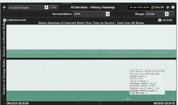
Use this display to assess utilization of cache capacity, over time, by all services in a cluster. Analyze load distribution across services and caches, check for bottlenecks and quickly identify services that need more threads. Answer questions such as:
Is their enough cache capacity available for the service?
Is their enough storage capacity available for the service?
Use the mouseover tool-tip to see how many caches the service runs on, and data for the selected metric.

|
Filter By: The display might include these filtering options: |
||||
|
|
Service Metric: |
Choose a service metric for which to display data in the heatmap. Use the mouse-over tool-tip to view metrics. Identify a service with high utilization. Perform node analysis by clicking One to view the Single Service History display. |
||
|
|
|
CPU% |
Percent of CPU utilization in the specified time range. |
|
|
|
|
Requests |
The number of client requests issued to the cluster in the specified time range. This metric is a good indicator of end-user utilization of the service. |
|
|
|
|
Messages |
The number of messages for the given node in the specified time range. |
|
|
|
|
ActiveThreads |
The number of threads in the service thread pool, not currently idle. |
|
|
|
|
TaskBacklog |
The size of the backlog queue that holds tasks scheduled to be executed by one of the service threads. Use this metric for determining capacity utilization for threads running on a service. For example, if the service has a high TaskBacklog rate and a low amount of CPU available, consider increasing the number of threads for the service to improve performance. |
|
|
|
|
RequestPending-Count |
The number of pending requests issued by the service. |
|
|
|
|
RequestAverage-Duration |
The average duration (in milliseconds) of an individual request issued by the service since the last time the statistics were reset. |
|
|
|
Time Range |
Select a time range from the drop down menu varying from 2 Minutes to Last 7 Days, or display All Data. To specify a time range, click Calendar 
By default, the time range end point is the current time. To change the time range end point, click Calendar Use the navigation arrows Click Restore to Now to reset the time range end point to the current time.
|
||
|
|
Enable MouseOver |
Select this option to make service details visible upon mouseover. |
||
|
|
History Heatmap of Selected Metric by Service |
Use the heatmap to view utilization trends for all services, over time, and quickly identify heavy usage, indicated by a dark color (by default, dark green). Look for a consistently dark horizontal line, which typically indicates constant high utilization. If this level of utilization is unexpected, consider performing a lower level analysis by viewing service details in the Single Service Summarydisplay. Two heatmaps, one for Process Nodes and another for Storage Nodes, show utilization trends for the selected metric, for all services running in the cluster. Each row represents a service. Cells in a row are sized uniformly. Each column represents a time period (typically in 10 second intervals). The color of the row cells represent the relative value of the selected service Metric, where a darker shade is a larger value. Use the mouseover tool-tip to see how many caches the service runs on, and data for the selected metric. |
||
|
|
|
Services on Process Nodes |
Each row represents a service. The color of the cells represents the relative value of the selected Service Metric, where a darker shade is a larger value. The size of the cells are uniform as they each represent one process node. Use the mouseover tool-tip to see how many caches the service runs on, and data for the selected metric. |
|
|
|
|
Services on Storage Nodes |
Each row represents a service. The color of the cells represents the relative value of the selected Service Metric, where a darker shade is a larger value. The size of the cells are uniform as they each represent one storage node. Use the mouseover tool-tip to see how many caches the service runs on, and data for the selected metric. |
|
|
|
Log Scale |
Enable to use a logarithmic scale for the Y axis. Use Log Scale to see usage correlations for data with a wide range of values. For example, if a minority of your data is on a scale of tens, and a majority of your data is on a scale of thousands, the minority of your data is typically not visible in non-log scale graphs. Log Scale makes data on both scales visible by applying logarithmic values rather than actual values to the data. |
||
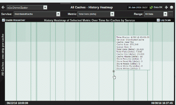
Use this display to assess capacity utilization, over time, for all caches in a cluster. Analyze load distribution, check for bottlenecks and quickly identify caches with high usage. Answer questions such as:
Is the cluster using what I expect?
Is the cluster using it in a uniform scale?
Use the mouseover tool-tip to see the name of the cache and data for the selected metric.

|
Filter By: |
||||
|
|
Cluster: |
Select a cluster for which to display data in the heatmap. |
||
|
|
Service: |
Select a service for which to display data in the heatmap. |
||
|
|
Metric: |
Select a metric for which to display data in the heatmap. |
||
|
|
|
Total Gets |
The total number of requests for data from this cache. |
|
|
|
|
Total Puts |
The total number of data stores into this cache. |
|
|
|
|
Cache Hits |
The total number of successful gets for this cache. |
|
|
|
|
Cache Misses |
The total number of failed gets for this cache. This metric indicates whether cache utilization is effective. For example, how often requests are made for data that does not exist in the cache. If a cache has a high rate of misses, consider performing a lower level analysis by viewing the cache in the Single Cache Summarydisplay. Check the metrics for Size, Evictions and Misses to determine whether more capacity is needed. |
|
|
|
|
Cache Size |
The total number of objects in the cache. |
|
|
|
|
StoreFailures (Delta) |
The total number of store failures on this cache since the last data sample. |
|
|
|
|
StoreReads (Delta) |
The total number of load operations on this cache since the last data sample. |
|
|
|
|
StoreReadMillis (Delta) |
The cumulative amount of time (in milliseconds) of load operations for this cache since the last data sample. |
|
|
|
|
StoreWrites (Delta) |
The total number of store and erase operations for this cache since the last data sample. |
|
|
|
|
StoreWritesMillis (Delta) |
The cumulative amount of time (in milliseconds) of store and erase operations on this cache since the last data sample. |
|
|
|
|
Total Gets |
The total number of requests for data from this cache. |
|
|
|
Range: |
Select a time range from the drop down menu varying from 2 Minutes to Last 7 Days, or display All Data. To specify a time range, click Calendar 
By default, the time range end point is the current time. To change the time range end point, click Calendar Use the navigation arrows Click Restore to Now to reset the time range end point to the current time.
|
||
|
|
AppName: |
Choose an AppName to show data for in the display. |
||
|
Fields and Data: |
||||
|
|
AppSlice Information |
Last Update: |
The date and time the data was last updated. |
|
|
|
|
Completed: |
The total number of completed processes summed across all processes in one AppSlice of the application. |
|
|
|
|
Suspended: |
The total number of suspended processes |
|
|
|
|
Failed: |
The total number of failed processes |
|
|
|
|
Created Rate: |
The number of application processes created per second. |
|
|
|
|
Failed Rate: |
The number of failed application processes per second. |
|
|
|
|
Avg Exec: |
The average number of seconds for processes to execute. |
|
|
|
|
Avg Elap: |
The average amount of elapsed time, in seconds. |
|
|
|
Time Range
|
Select a time range from the drop down menu varying from 2 Minutes to Last 7 Days, or display All Data. To specify a time range, click Calendar 
By default, the time range end point is the current time. To change the time range end point, click Calendar Use the navigation arrows Click Restore to Now to reset the time range end point to the current time.
|
||
|
|
Enable MouseOver |
Select this option to make cache details visible upon mouseover. |
||
|
|
History Heatmap of Selected Metric |
Use the heatmap to view utilization trends for all caches, over time, and quickly identify heavy usage, indicated by a dark color (by default, dark green). Look for a consistently dark horizontal line, which typically indicates constant high utilization. If this level of utilization is unexpected, consider performing a lower level analysis by viewing cache details in the Single Cache Summary display. Also look for a dark vertical line, which indicates that all the caches, nodes or services are being used simultaneously. Typically this indicates further analysis is needed. The heatmap shows cache utilization trends for the selected service and metric, for all caches running in the cluster. Each row represents a cache. Cells in a row are sized uniformly and represent one process node. Each column represents a time period (typically in 10 second intervals). The heatmap is grouped vertically by service. The color of the row cells represent the relative value of the selected service Metric, where a darker shade is a larger value. Use the mouseover tool-tip to see the name of the cache and data for the selected metric. |
||
|
|
Log Scale |
Select to enable a logarithmic scale. Use Log Scale to see usage correlations for data with a wide range of values. For example, if a minority of your data is on a scale of tens, and a majority of your data is on a scale of thousands, the minority of your data is typically not visible in non-log scale graphs. Log Scale makes data on both scales visible by applying logarithmic values rather than actual values to the data. |
||
|
|
Base at Zero |
Use zero as the Y axis minimum for all graph traces. |
||
|
|
Time Range |
Select a time range from the drop down menu varying from 2 Minutes to Last 7 Days, or display All Data. To specify a time range, click Calendar 
By default, the time range end point is the current time. To change the time range end point, click Calendar Use the navigation arrows Click Restore to Now to reset the time range end point to the current time.
|
||
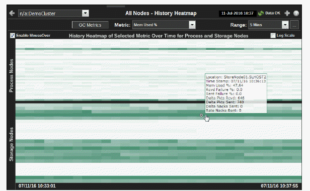
Use this display to assess capacity utilization, over time, for all nodes in a cluster. Analyze load distribution, check for bottlenecks and quickly identify nodes with high usage. Use the mouseover tool-tip to see the node hostname and data for the selected metric.

|
Filter By: |
||||
|
|
Cluster: |
Select a cluster for which to display data in the heatmap. |
||
|
|
GC Metrics |
Click to open the All Nodes History display which shows GC Duty Cycle for all the nodes in a cluster. |
||
|
|
Metric: |
Select a metric for which to display data in the heatmap. |
||
|
|
|
Mem Used% |
The percent (%) of memory used by the node. |
|
|
|
|
Packets Sent Fail% |
The percent (%) of packets that had to be resent by this node. |
|
|
|
|
Packets Rcvd Fail% |
The percent (%) of packets that failed to be received by this node. |
|
|
|
|
Delta Packets Sent |
The number of packets sent by this node since the last data sample. |
|
|
|
|
Delta Packets Rcvd |
The number of packets received by this node since the last data sample. |
|
|
|
|
Delta Nacks Sent |
The number of TCMP packets sent by this node since the last data sample. Use this data to troubleshoot communication errors. |
|
|
|
Range
|
Select a time range from the drop down menu varying from 2 Minutes to Last 7 Days, or display All Data. To specify a time range, click Calendar 
By default, the time range end point is the current time. To change the time range end point, click Calendar Use the navigation arrows Click Restore to Now to reset the time range end point to the current time.
|
||
|
|
Enable MouseOver |
Select this option to make cache details visible upon mouseover. |
||
|
|
History Heatmap of Selected Metric |
Use the heatmap to view utilization trends for all nodes, over time, and quickly identify heavy usage, indicated by a dark color (by default, dark green). Look for a consistently dark horizontal line, which typically indicates constant high utilization. If this level of utilization is unexpected, consider performing a lower level analysis by viewing node details in the Node Summary display. Two heatmaps, one for Process Nodes and another for Storage Nodes, show utilization trends for the selected metric, for all nodes running in the cluster. Each row represents a node. Cells in a row are sized uniformly. Each column represents a time period (typically in 10 second intervals). The color of the row cells represent the relative value of the selected service Metric, where a darker shade is a larger value. Use the mouseover tool-tip to see the node hostname and data for the selected metric. |
||
|
|
|
Process Nodes |
Each row represents a node. The color of the cells represents the relative value of the selected Service Metric, where a darker shade is a larger value. The size of the cells are uniform. Use the mouseover tool-tip to see the node hostname and data for the selected metric. |
|
|
|
|
Storage Nodes |
Each row represents a node. The color of the cells represents the relative value of the selected Service Metric, where a darker shade is a larger value. The size of the cells are uniform. Use the mouseover tool-tip to see the node hostname and data for the selected metric. |
|
|
|
Log Scale |
Select to enable a logarithmic scale. Use Log Scale to see usage correlations for data with a wide range of values. For example, if a minority of your data is on a scale of tens, and a majority of your data is on a scale of thousands, the minority of your data is typically not visible in non-log scale graphs. Log Scale makes data on both scales visible by applying logarithmic values rather than actual values to the data. |
||


 .
.  and select a date and time from the calendar or enter the date and time in the text field using the following format:
  to move forward or backward one time period. NOTE: The time period is determined by your selection from the
  .
.  and select a date and time from the calendar or enter the date and time in the text field using the following format:
  to move forward or backward one time period. NOTE: The time period is determined by your selection from the
  .
.  and select a date and time from the calendar or enter the date and time in the text field using the following format:
  to move forward or backward one time period. NOTE: The time period is determined by your selection from the
  .
.  and select a date and time from the calendar or enter the date and time in the text field using the following format:
  to move forward or backward one time period. NOTE: The time period is determined by your selection from the
  .
.  and select a date and time from the calendar or enter the date and time in the text field using the following format:
  to move forward or backward one time period. NOTE: The time period is determined by your selection from the
  .
.  and select a date and time from the calendar or enter the date and time in the text field using the following format:
  to move forward or backward one time period. NOTE: The time period is determined by your selection from the
  .
.  and select a date and time from the calendar or enter the date and time in the text field using the following format:
  to move forward or backward one time period. NOTE: The time period is determined by your selection from the